5. Beginning: Plotting
5.1. Introduction
This use case shows a user how to plot cell and point data. Plotting can be along a line that cuts through your data, or a location with respect to time.
5.2. Plot along a line
Open can.ex2.
Apply.
Drag the can around with the left mouse button until you can see the can.
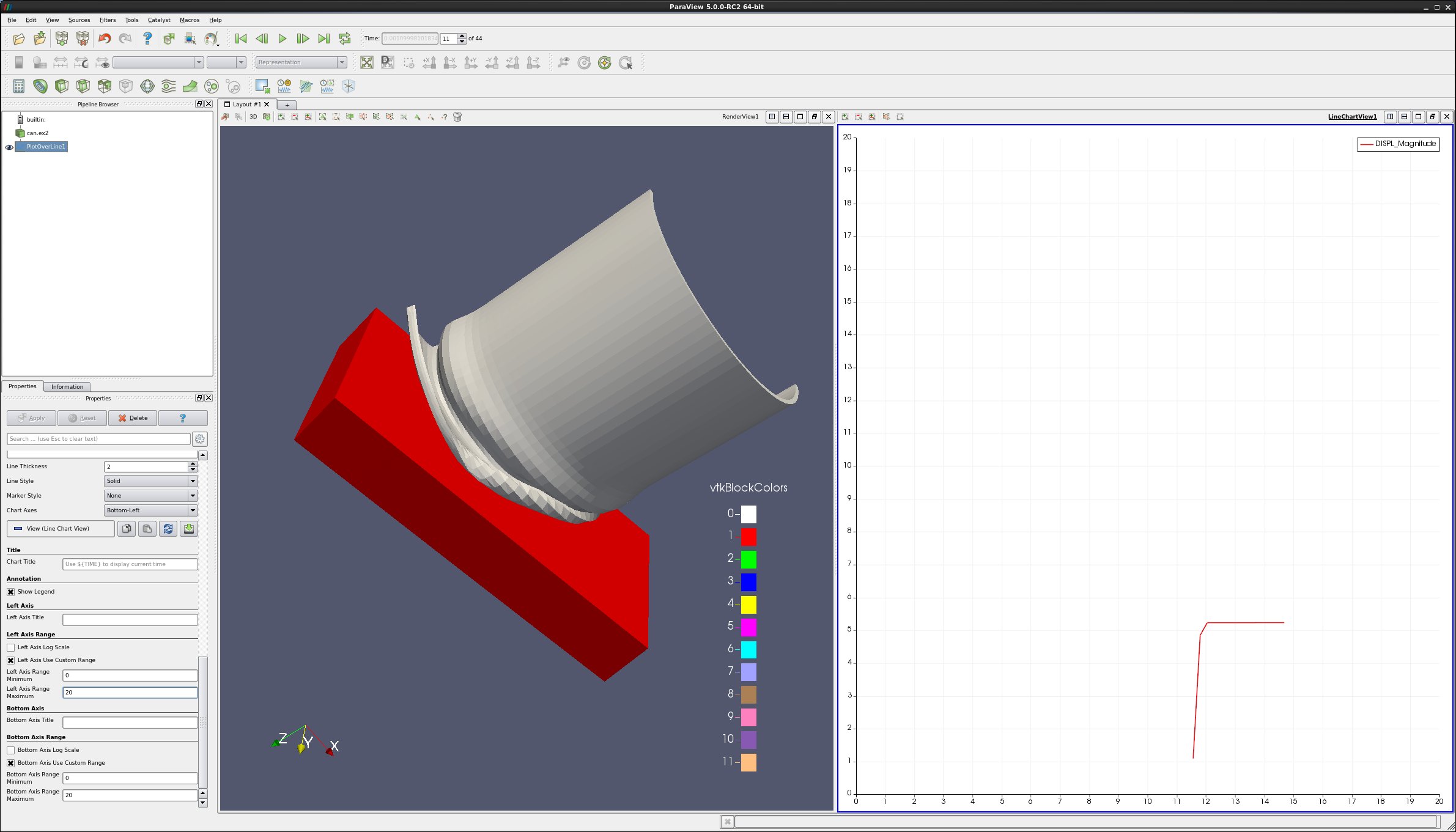
Select Filter → Data Analysis → Plot Over Line.
Drag the top of the line to intersect the top of the can. Note that hitting the p key will also place the line on the surface of your object. You can also use the 1 and 2 keys to set the beginning and end of the line.
Apply.
In the Properties tab, unselect all variables except DISPL (Magnitude).
Lower on the Properties tab, select Left Axis Use Custom Range, and enter 0.0 and 20.0.
Select Bottom Axis Use Custom Range, and enter 0.0 and 20.0.
Play the animation forward, and notice what happens to the plot.
You can also add plot labels and axis labels on the properties tab.
5.3. Plot point over time
Edit → Reset Session.
Open can.ex2.
Apply.
Drag the can around with the left mouse button until you can see the can.
We want to plot a point over time.
First, we need to select a point.
Click on Select Points On icon.
Then, click on a point on the can.
Filters → Domain → Data Analysis → Plot Point Over Time.
Apply.
In the Properties tab, unselect everything except DISPL (Magnitude).
You now have a plot of the displacement. at your point.
Extra Credit:
Using Select Cells On icon, and Plot Cell Over Time, plot EQPS over time.
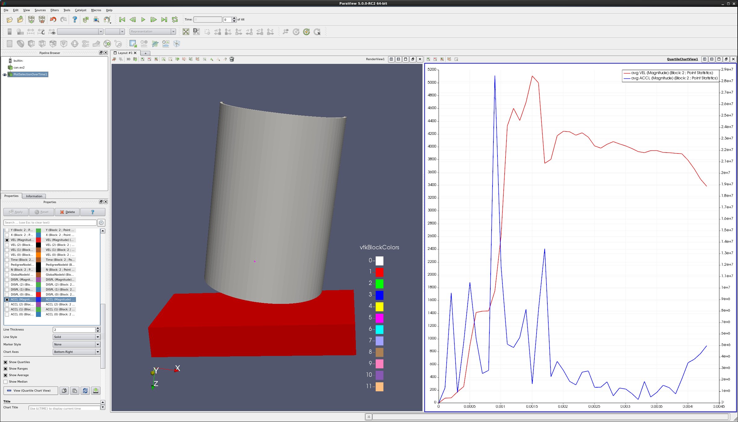
5.4. Plot two variables at same time
Follow the steps for Plot Point over time, as described above.
In the Properties tab, turn off DISPL (Magnitude), and turn on variables VEL (Magnitude) and ACCL (Magnitude).
Select the line that says ACCL (Magnitude), causing this row to turn gray.
At the bottom of the Properties tab, change Chart Axes to Bottom-Right.
Note below that the ACCL (Magnitude) color has been changed to blue.
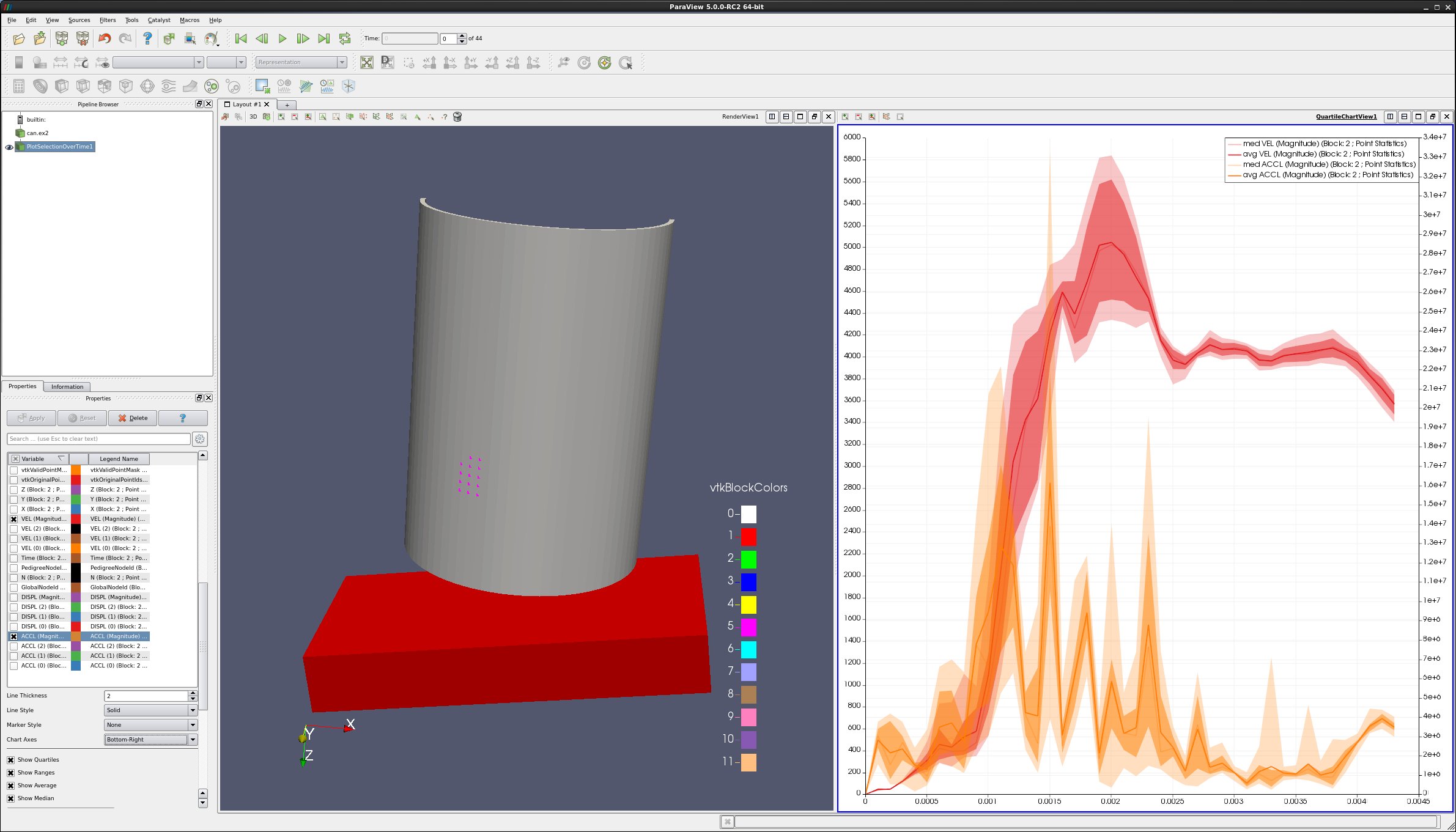
5.5. Plot multiple points (statistics plot version)
Edit → Reset Session.
Open can.ex2.
Apply.
Drag the can around with the left mouse button until you can see the can.
We want to plot numerous points over time. First, we need to select the points.
Click on Select Points On icon. Then, rubber band select a dozen points.
Filters → Domain → Data Analysis → Plot Selection Over Time.
Apply.
On the Properties tab, turn off all variables, and then turn on variables VEL (Magnitude) and ACCL (Magnitude).
Select the line that says ACCL (Magnitude), causing this row to turn gray.
In the Properties tab, change Chart Axes to Bottom-Right.
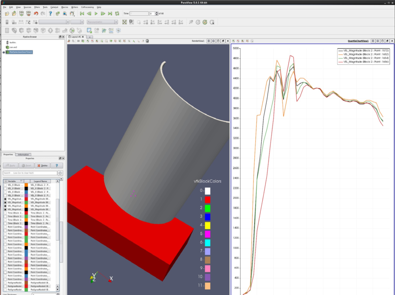
5.6. Plot multiple points (spaghetti plot version)
Edit → Reset Session.
Open can.ex2.
Apply.
Drag the can around with the left mouse button until you can see the can.
We want to plot numerous points over time. First, we need to select the points.
Click on Select Points On icon. Then, rubber band select about four points.
Filters → Domain → Data Analysis → Plot Selection Over Time.
Apply.
On the Properties. tab, unselect the Only Report Selection Statistics checkbox.
Apply.
On the Properties tab, display section, click on Root, turning on all of the points or cells.
On the Properties tab, turn off everything, then turn on all variables VEL (Magnitude).
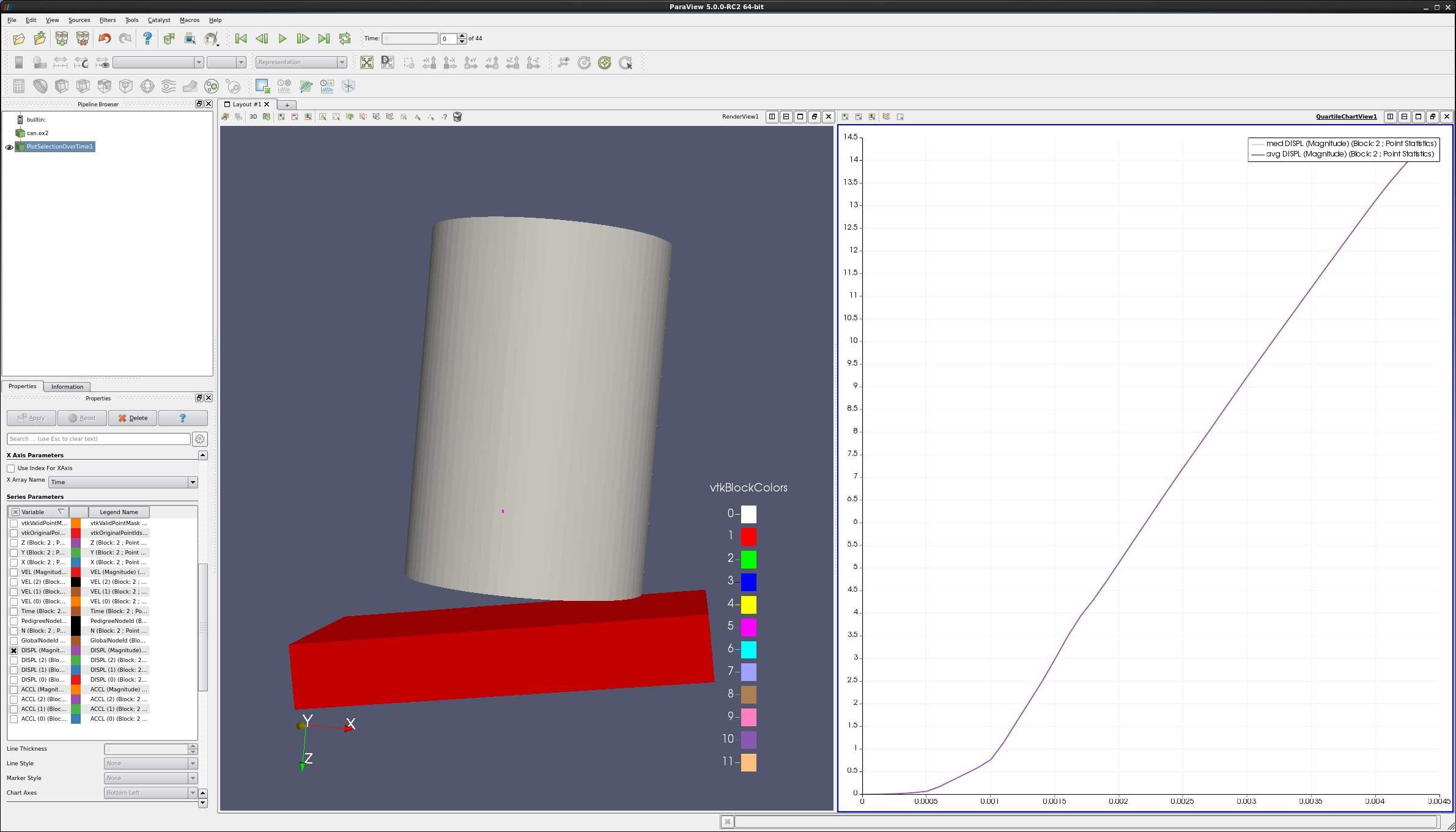
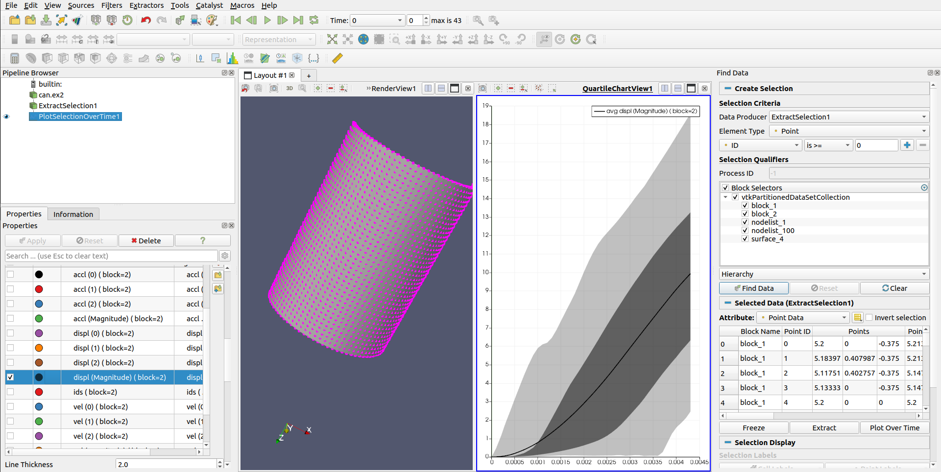
5.7. Plot min, max and average for all points of a block over time
Edit → Reset Session.
Open can.ex2.
Apply.
Drag the can around with the left mouse button until you can see the can.
We want to plot all of the can points over time. First, we need to select the points.
Click on Select Block icon.
Select the can.
Filters → Domain → Data Analysis → Extract Selection.
Apply.
We now have the can.
Select Edit -> Find Data.
Set Data Producer to ExtractSelection1.
Set Element Type to Point.
Use ID and is >= and 0.
Find Data.
Plot Selection Over Time.
Apply.
In Series Parameters, turn off everything except DISPL (Magnitude)
5.8. Plot data
Edit → Reset Session.
Open can.ex2.
Apply.
Drag the can around with the left mouse button until you can see the can.
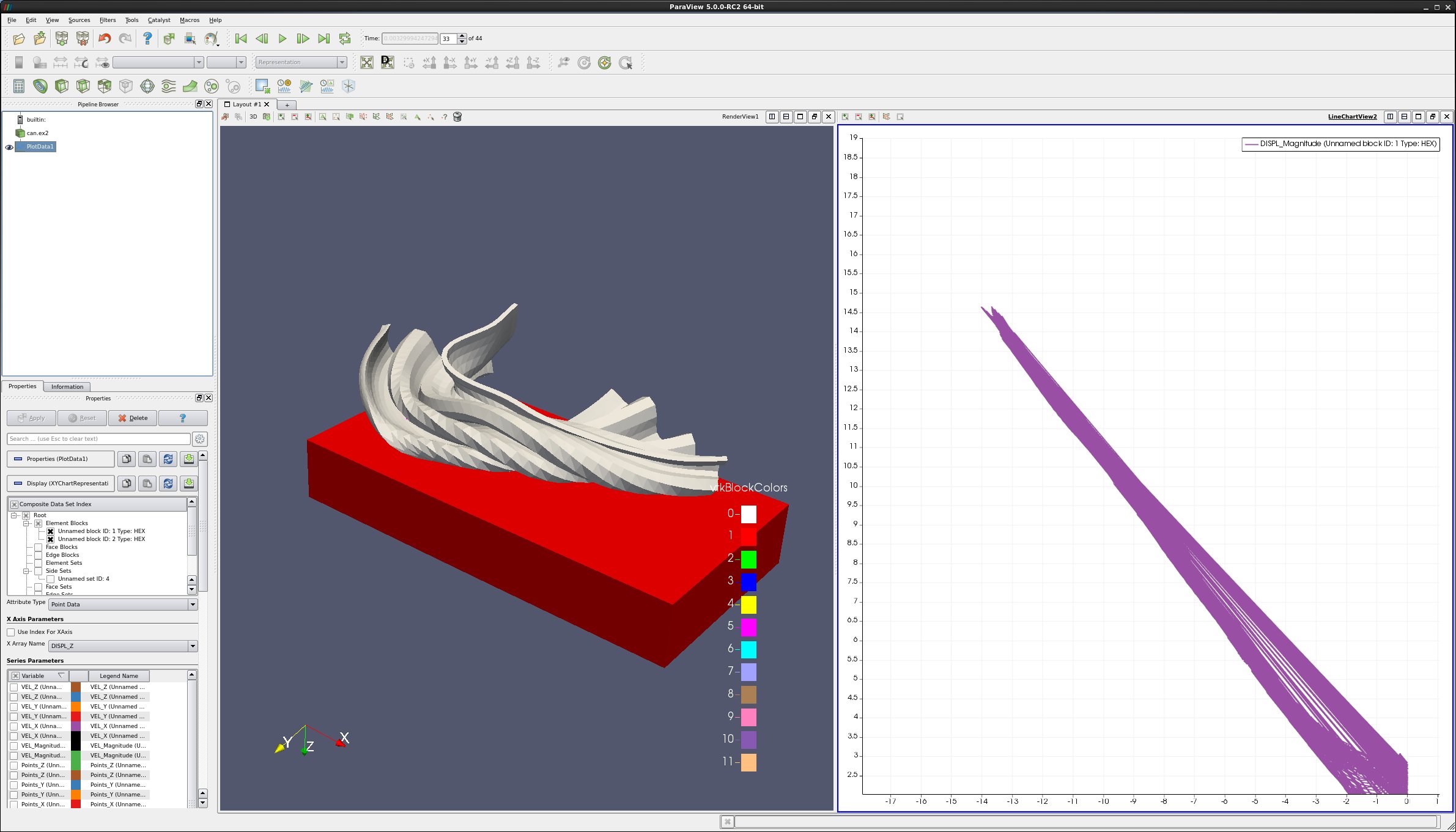
We want to plot two variables against each other, for all points (or cells) of the can.
Filters → Domain → Data Analysis → Plot Data.
Apply.
On the Properties tab, turn off Use Index for X Array and for X Array Name select DISPL_Z
In Series Parameters, turn off everything except DISPL (Magnitude)
Play