2. Basic Usage
Let us get started using ParaView. In order to follow along, you will
need your own installation of ParaView. If you do not already have ParaView,
you can download a copy from https://www.paraview.org/Download/.
ParaView launches like most other applications. On Windows, the
launcher is located in the start menu. On Macintosh, open the
application bundle that you installed. On Linux, execute paraview from a command
prompt (you may need to set your path).
The examples in this tutorial rely on some data that is included with the binary distribution of ParaView. These files are found in the Examples directory on the left side of the File/Open dialog.
2.1. User Interface
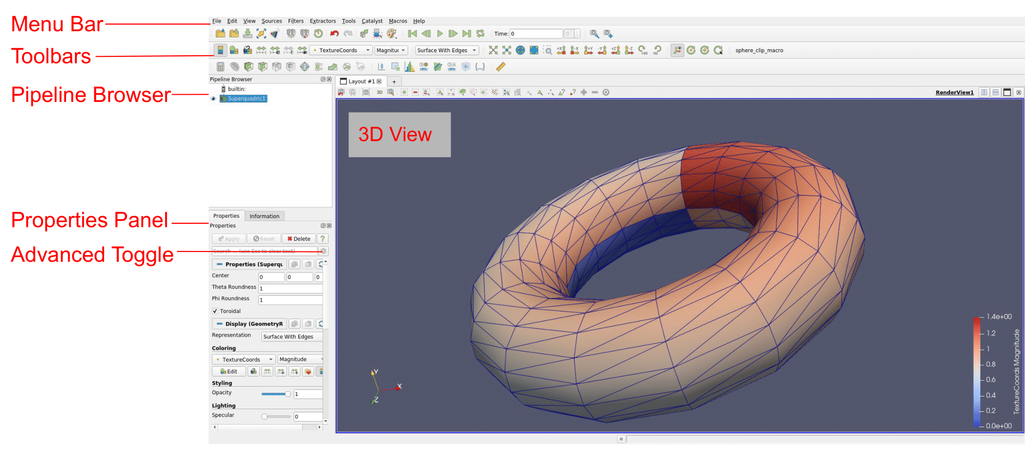
The ParaView GUI conforms to the platform on which it is running, but on all platforms it behaves basically the same. The layout shown here is the default layout given when ParaView is first started. The GUI consists of the following components.
- Menu Bar
As with just about any other program, the menu bar allows you to access the majority of features.
- Toolbars
The toolbars provide quick access to the most commonly used features within ParaView.
- Pipeline Browser
ParaView manages the reading and filtering of data with a pipeline. The pipeline browser allows you to view the pipeline structure and select pipeline objects. The pipeline browser provides a convenient list of pipeline objects with an indentation style that shows the pipeline structure.
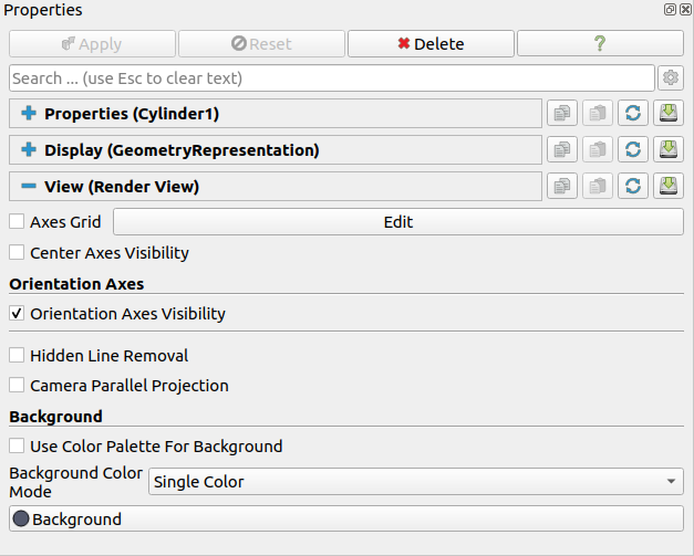
- Properties Panel
The properties panel allows you to view and change the parameters of the current pipeline object. On the properties panel is an advanced properties toggle
 that shows and hides advanced controls. The
properties are by default coupled with an Information tab that shows a basic
summary of the data produced by the pipeline object.
that shows and hides advanced controls. The
properties are by default coupled with an Information tab that shows a basic
summary of the data produced by the pipeline object.- 3D View
The remainder of the GUI is used to present data so that you may view, interact with, and explore your data. This area is initially populated with a 3D view that will provide a geometric representation of the data.
Note that the GUI layout is highly configurable, so that it is easy to change the look of the window. The toolbars can be moved around and even hidden from view. To toggle the use of a toolbar, use the View → Toolbars submenu. The pipeline browser and properties panel are both dockable windows. This means that these components can be moved around in the GUI, torn off as their own floating windows, or hidden altogether. These two windows are important to the operation of ParaView, so if you hide them and then need them again, you can get them back with the View menu.
2.2. Sources
There are two ways to get data into ParaView: read data from a file or generate data with a source object. All sources are located in the Sources menu. Sources can be used to add annotations to a view, but they are also very handy when exploring ParaView’s features.
Exercise 2.1 (Creating a Source)
Let us start with a simple one. Go to the Sources
menu, open the Geometric Shapes submenu, and select Cylinder. Once you
select the Cylinder item you will notice that an item named Cylinder1
is added to and selected in the pipeline browser. You will also notice
that the properties panel is filled with the properties for the
cylinder source. Click the Apply button  to accept the default
parameters.
to accept the default
parameters.
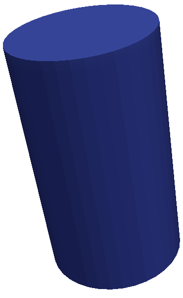
Once you click Apply, the cylinder object will be displayed in the 3D view window on the right.
2.3. Basic 3D Interaction
Now that we have created our first simple visualization, we want to interact with it. There are many ways to interact with a visualization in ParaView. We start by exploring the data in the 3D view.
Exercise 2.2 (Interacting with a 3D View)
This exercise is a continuation of Exercise 2.1. You will need to finish that exercise before beginning this one.
You can manipulate the cylinder in the 3D view by dragging the mouse over the 3D view. Experiment with dragging different mouse buttons—left, middle, and right—to perform different rotate, pan, and zoom operations. Also try using the buttons in conjunction with the shift and ctrl modifier keys. Additionally you can hold down the x, y, or z key while you drag the mouse to constrain movement along the x, y, or z axis.

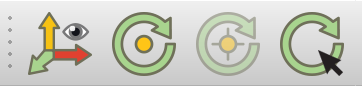
ParaView contains a couple of toolbars to help with camera
manipulations. The first toolbar, the Camera Controls toolbar, shown
here, provides quick access to particular camera views. The leftmost
 button performs a reset camera such that it maintains
the same view direction but repositions the camera such that the entire
object can be seen. The second button
button performs a reset camera such that it maintains
the same view direction but repositions the camera such that the entire
object can be seen. The second button  performs a
zoom to data. It behaves very much like reset camera except that
instead of positioning the camera to see all data, the camera is placed
to look specifically at the data currently selected in the pipeline
browser. The third button
performs a
zoom to data. It behaves very much like reset camera except that
instead of positioning the camera to see all data, the camera is placed
to look specifically at the data currently selected in the pipeline
browser. The third button  performs a
reset camera closest such that it maximizes the occupation
on the screen of the whole scene bounding box. The fourth button
performs a
reset camera closest such that it maximizes the occupation
on the screen of the whole scene bounding box. The fourth button
 performs a zoom closest to data. It behaves
very much like reset camera closest except that instead of positioning
the camera to see all data, the camera is placed to look specifically
at the data currently selected in the pipeline browser. You currently
only have one object in the pipeline browser, so right now reset camera
and zoom to data, and reset camera closest and zoom closest to data will
perform the same operation.
performs a zoom closest to data. It behaves
very much like reset camera closest except that instead of positioning
the camera to see all data, the camera is placed to look specifically
at the data currently selected in the pipeline browser. You currently
only have one object in the pipeline browser, so right now reset camera
and zoom to data, and reset camera closest and zoom closest to data will
perform the same operation.
The next button in the camera controls toolbar  allows
you to select a rectangular region of the screen to zoom to (a rubber-band zoom).
Just using the left mouse button will allow you to select a corner and rubber-band zoom
to the other corner. If you also press the Shift key, the rubber-band zoom will
start in the middle and expand outward. The following six buttons,
starting with
allows
you to select a rectangular region of the screen to zoom to (a rubber-band zoom).
Just using the left mouse button will allow you to select a corner and rubber-band zoom
to the other corner. If you also press the Shift key, the rubber-band zoom will
start in the middle and expand outward. The following six buttons,
starting with  , reposition the camera to view
the scene straight down one of the global coordinate’s axes in either
the positive or negative direction. The rightmost two buttons
, reposition the camera to view
the scene straight down one of the global coordinate’s axes in either
the positive or negative direction. The rightmost two buttons 
 rotate the view either clockwise or counterclockwise. Try
playing with these controls now.
rotate the view either clockwise or counterclockwise. Try
playing with these controls now.
The second toolbar controls the location of the center of rotation and
the visibility of the orientation axes. The rightmost button  allows you to pick the center of rotation. Try clicking that button then
clicking somewhere on the cylinder. If you then drag the left button in
the 3D view, you will notice that the cylinder now rotates around this
new point. The next button to the left
allows you to pick the center of rotation. Try clicking that button then
clicking somewhere on the cylinder. If you then drag the left button in
the 3D view, you will notice that the cylinder now rotates around this
new point. The next button to the left  replaces the center
of rotation to the center of the object. The next button to the left
replaces the center
of rotation to the center of the object. The next button to the left  shows or hides axes drawn at the center of rotation. (You probably will not notice
the effects when the center of rotation is at the center of the cylinder
because the axes will be hidden by the cylinder. Use the pick center of
rotation again and you should be able to see the effects.)
The final leftmost button
shows or hides axes drawn at the center of rotation. (You probably will not notice
the effects when the center of rotation is at the center of the cylinder
because the axes will be hidden by the cylinder. Use the pick center of
rotation again and you should be able to see the effects.)
The final leftmost button  toggles showing the
orientation axes, the axes viewable by default in the lower left corner
of the 3D view.
toggles showing the
orientation axes, the axes viewable by default in the lower left corner
of the 3D view.
2.4. Modifying Visualization Parameters
Although interactive 3D controls are a vital part of visualization, an equally important ability is to modify the parameters of the data processing and display. ParaView contains many GUI components for modifying visualization parameters, which we will begin to explore in the next exercise.
Exercise 2.3 (Modifying Visualization Parameters)
This exercise is a continuation of Exercise 2.2. You will need to finish that exercise before beginning this one.
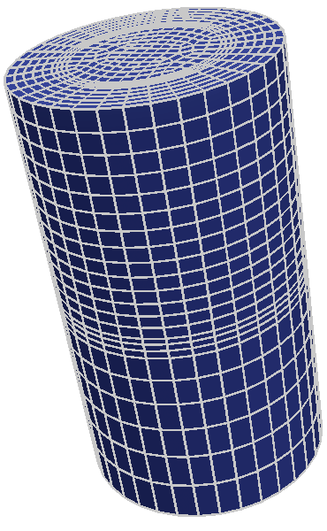
You surely noticed that ParaView creates not a real cylinder but rather
an approximation of a cylinder using polygonal facets. The default
parameters for the cylinder source provide a very coarse approximation
of only six facets. (In fact, this object looks more like a prism than a
cylinder.) If we want a better representation of a cylinder, we can
create one by increasing the Resolution parameter. The Resolution
parameters, like all other parameters for the cylinder object, are
located in the properties panel under the button when the cylinder
object is selected in the pipeline browser.
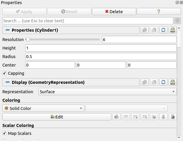
Using either the slider or text edit, increase the resolution to 50 or
more. Notice that the Apply button became colored again. This is because
changes you make to the object properties are not immediately enacted.
The highlighted button is a reminder that the parameters of one or more
pipeline objects are “out of sync” with the data that you are viewing.
Hitting the Apply button will accept these changes whereas hitting the
Reset button  will revert the options back to the last time they
were applied. Hit the Apply button now. The resolution is changed so that
it is virtually indistinguishable from a true cylinder.
will revert the options back to the last time they
were applied. Hit the Apply button now. The resolution is changed so that
it is virtually indistinguishable from a true cylinder.
If your work has you creating cylinder sources frequently and you find
yourself modifying Resolution or other parameters to some value other
than the default each time, you can save your preferred default
parameters by hitting the save parameters button  . Once you hit the
button, ParaView will remember your preferences for objects of
that type and use those parameters when you create future objects. Conversely,
if you have changed the parameters and want to reset them to the “factory
default,” you can click the restore parameters button
. Once you hit the
button, ParaView will remember your preferences for objects of
that type and use those parameters when you create future objects. Conversely,
if you have changed the parameters and want to reset them to the “factory
default,” you can click the restore parameters button  . As we will
see in future exercises, we can have multiple visualization objects open at
once. To copy parameters from one object to another, use the copy
. As we will
see in future exercises, we can have multiple visualization objects open at
once. To copy parameters from one object to another, use the copy  and
paste
and
paste  parameters buttons.
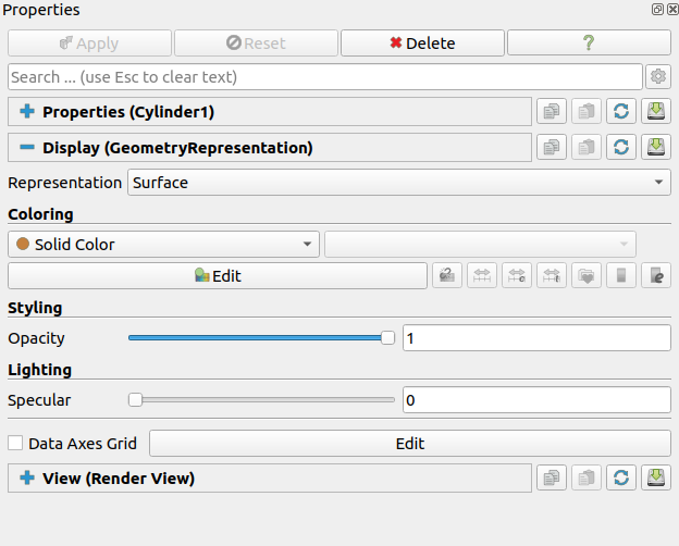
If you scroll down the properties panel, you will notice a set of
Display properties. Try these options now by clicking on the Edit  button under Coloring to select a new color for the cylinder. (This
button is also replicated in the toolbar.) You may notice that you do
not need to hit Apply for display properties.
button under Coloring to select a new color for the cylinder. (This
button is also replicated in the toolbar.) You may notice that you do
not need to hit Apply for display properties.
By default many of the lesser used display properties are hidden. The
advanced properties toggle can be used to show or hide these extra
parameters. There is also a search box at the top of the properties
panel that can be used to quickly find a property. Try typing specular
into this search box now. Under the display properties you should see an
option named Specular. This controls the intensity of the specular
highlight seen on shiny objects. Set this parameter to 1 to make the
cylinder shiny.
Most objects have similar display and view properties. Here are some other common tricks you can do with most objects using parameters available in the properties panel and that you can try now.
Show 3D axes or rulers at the borders of the object in each direction by clicking the Axes Grid checkbox under the View options. Select Edit to customize the Axis Grid. Toggle the advanced properties toggle
to see more options.Make objects transparent by changing their Opacity parameter. An opacity parameter of 1 is completely opaque, a parameter of 0 is completely invisible, and values in between are varying degrees of see through.
From the previous exercises you have noted that some visualization operations (but not all) require pressing the Apply button before seeing the effect of the change. This apply button serves an important function. When visualizing large data, which ParaView is designed to do, simple actions like creating an object or changing a parameter can take a long time. Thus this two phased approach allows you to establish all the visualization parameters for a particular action before enacting an operation (by hitting Apply). However, when dealing with small data, operations complete near instantaneously, so the process of hitting Apply becomes redundant. In these cases, you may wish to turn on auto apply.
Exercise 2.4 (Toggle Auto Apply)
Find the auto apply  button in the top toolbar.
This is a toggle button. Click it now and note that it stays depressed.
button in the top toolbar.
This is a toggle button. Click it now and note that it stays depressed.
While auto apply is on, it is no longer necessary to hit the Apply button. Try changing the Resolution of the cylinder source as you did in Exercise 2.3 (or create a new source if your cylinder is no longer available). Note that as soon as you make the change, the visualization is updated.
You can turn off auto apply by clicking the toolbar button again.
You can complete the rest of these exercises with auto apply either on or
off. The instructions will assume that auto apply is off and prompt you
to hit the Apply button. If you have auto apply on, ignore these
instructions.
As you would expect, ParaView allows you to control the color of many
elements of the view. In many cases changing the color of one element
necessitates the changing of others. For example, if you change the View
background to a light color, it is important to change text colors
to a dark color. Otherwise the text will be unreadable. To
help manage sets of interdependent colors, ParaView supports the idea of
color palettes. You can easily change the view’s color palette using the
load color palette button  in the toolbar.
Exercise 2.5 (Changing the Color Palette)
Make sure the orientation axes is shown in the lower left corner.
This is toggled with the button as described
in Exercise 2.2. Note that the orientation axis has
the labels “X,” “Y,” and “Z.”
Find the load color palette button in the top toolbar. Click that button
to get a pull down menu of available palettes. Experiment with different
palettes. Observe that both the background color and the labels in the
orientation axes change.
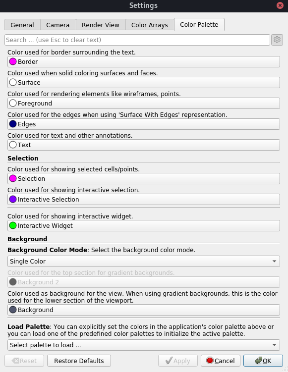
The colors used for the color palettes are part of ParaView’s settings.
You can see and set all of these colors in the Edit
→ Settings (ParaView → Preferences
on the Mac) under the Color Palette tab. You can also get to the color
palette settings by clicking on the color palette button and
selecting the Edit Current Palette… button.
Now is a good time to note the undo  and redo
  buttons in the toolbar.
Visualizing your data is often an exploratory process, and it is often
helpful to revert back to a previous state. You can even undo back to
the point before your data were created and redo again.
buttons in the toolbar.
Visualizing your data is often an exploratory process, and it is often
helpful to revert back to a previous state. You can even undo back to
the point before your data were created and redo again.
Exercise 2.6 (Undo, Redo and Reset Session)
Experiment with the undo and redo buttons. If you have not done so,
create and modify a pipeline object like what is done in Exercise 2.1.
Watch how parameter changes can be reverted and restored. Also notice how whole
pipeline objects can be destroyed and recreated.
There are also undo camera  and redo camera
  buttons at the view’s
toolbar. These allow you to go back and forth between camera angles that
you have made so that you do not have to worry about errant mouse
movements ruining that perfect view. Move the camera around and then use
these buttons to revert and restore the camera angle.
buttons at the view’s
toolbar. These allow you to go back and forth between camera angles that
you have made so that you do not have to worry about errant mouse
movements ruining that perfect view. Move the camera around and then use
these buttons to revert and restore the camera angle.
When you want to reset your session, meaning set ParaView to a clean state, use the
 button. As we are done with the cylinder source, we want to
Reset Session. Click the button now. Another way to do the same thing is with Cylinder1
selected in the pipeline browser, click the
button. As we are done with the cylinder source, we want to
Reset Session. Click the button now. Another way to do the same thing is with Cylinder1
selected in the pipeline browser, click the  button in the properties tab. Yet another way to delete items
in the pipeline browser is to right click on the item and select Delete or
Delete Downstream Pipeline.
button in the properties tab. Yet another way to delete items
in the pipeline browser is to right click on the item and select Delete or
Delete Downstream Pipeline.
2.5. Loading Data
Now that we have had some practice using the ParaView GUI, let us load
in some real data. As you would expect, the Open command is the first
one off of the File menu, and there is also a toolbar button  for opening
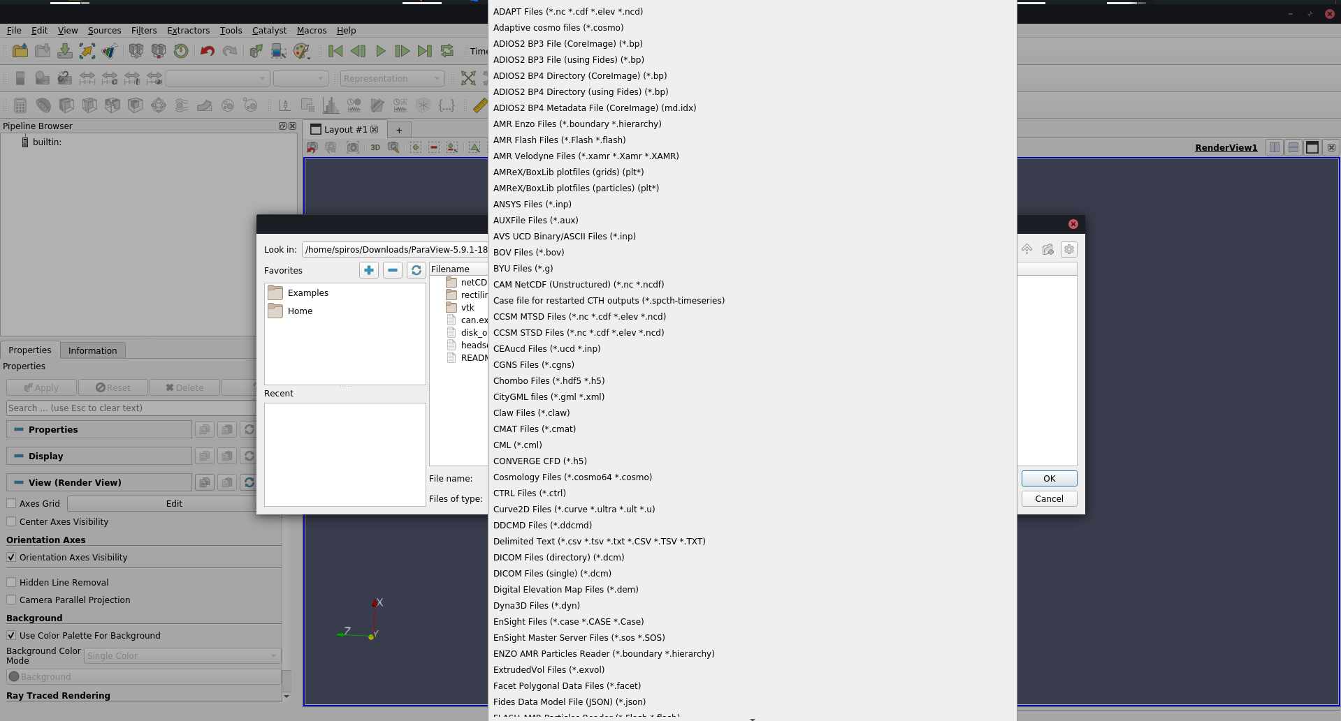
files and datasets. ParaView currently supports about 220 distinct file formats, and
the list grows as more types get added. To see the current list of
supported files, invoke the Open command and look at the list of files
in the Files of type chooser box.
for opening
files and datasets. ParaView currently supports about 220 distinct file formats, and
the list grows as more types get added. To see the current list of
supported files, invoke the Open command and look at the list of files
in the Files of type chooser box.
ParaView’s modular design allows for easy integration of new VTK readers into ParaView. Thus, check back often for new file formats. If you are looking for a file reader that does not seem to be included with ParaView, check in with the ParaView community support site. This can be found on the ParaView Help menu. There are many file readers included with VTK but not exposed within ParaView that could easily be added. There are also many readers created that can plug into the VTK framework but have not been committed back to VTK; someone may have a reader readily available that you can use.
Exercise 2.7 (Opening a File)
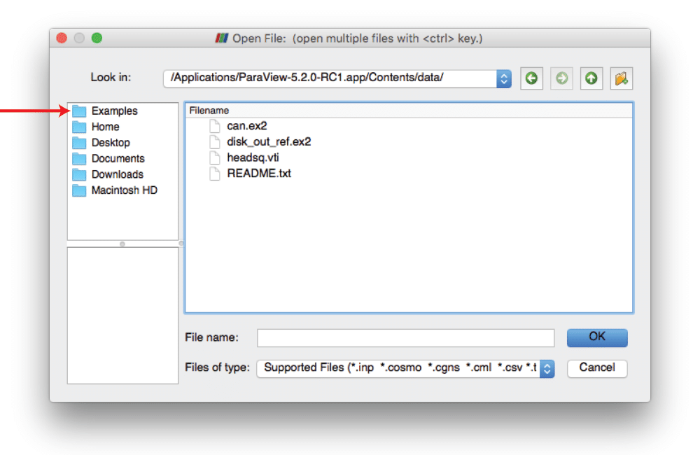
Let us open our first file now. Click the Open
toolbar button (or menu item) . Note that ParaView uses a custom file
browser, which provides several convenience features. On the left side
of the file browser dialog are three boxes containing lists of
directories, which provide quick access to frequently used
directories. The top left list, which is initially empty,
includes directories that you have marked as
favorites. The middle left list contains a list of common
directories on your system that frequently hold datasets. The bottom left list,
which is also initially empty, is filled with directories from which you have recently loaded
files and datasets. Double click on the Examples directory listed in the middle left
box. This is a directory created by the ParaView installation that
contains the files we use in this tutorial.
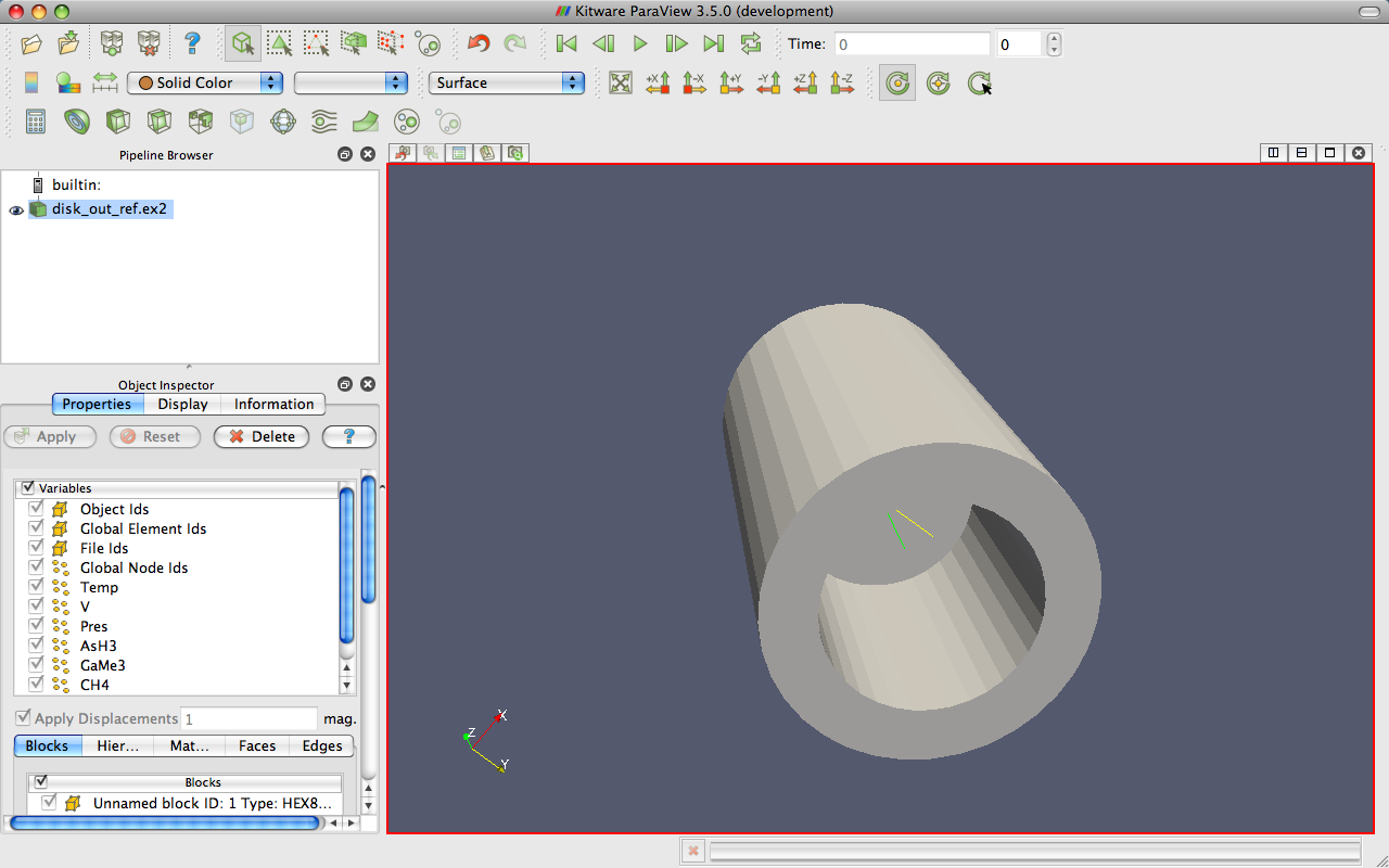
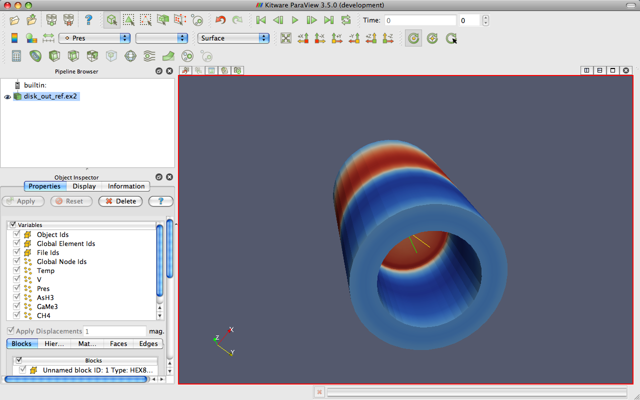
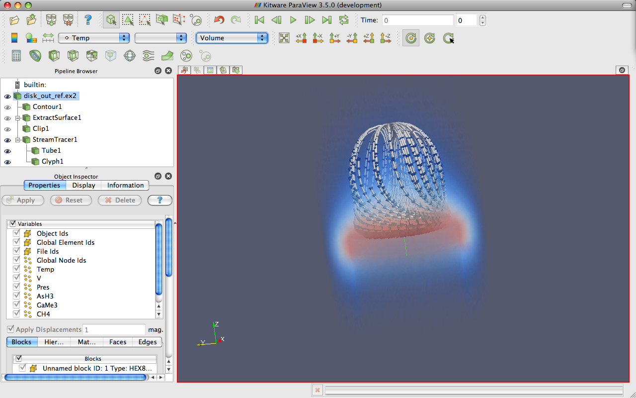
Open the file disk_out_ref.ex2. Note that opening a file is a two step process, so you will not see any data yet. Instead, you see that the properties panel is populated with several options about how we want to read the data.
All blocks and variables are selected by default. This is a small dataset, so we do not
have to worry about loading too much data into memory. Click to load
disk_out_ref.exo. When the mesh and data is
loaded you will see that the geometry looks like a cylinder with a
hollowed out portion in one end. The mesh and data is the output of a
simulation for the flow of air around a heated and spinning disk. The
mesh you are seeing is the air around the disk (with the cylinder shape
being the boundary of the simulation). The hollow area in the middle is
where the heated disk would be were it meshed for the simulation.
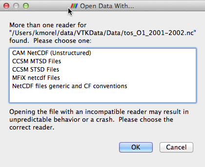
Most of the time ParaView will be able to determine the appropriate method to read your file based on the file extension and underlying data, as was the case in Exercise 2.7. However, with so many file formats supported by ParaView there are some files whose readers cannot be automatically determined. In this case, ParaView will present a dialog box asking what type of reader should be used. The following image is an example from opening a netCDF file, which is a generic file format for which ParaView has many readers for different conventions.
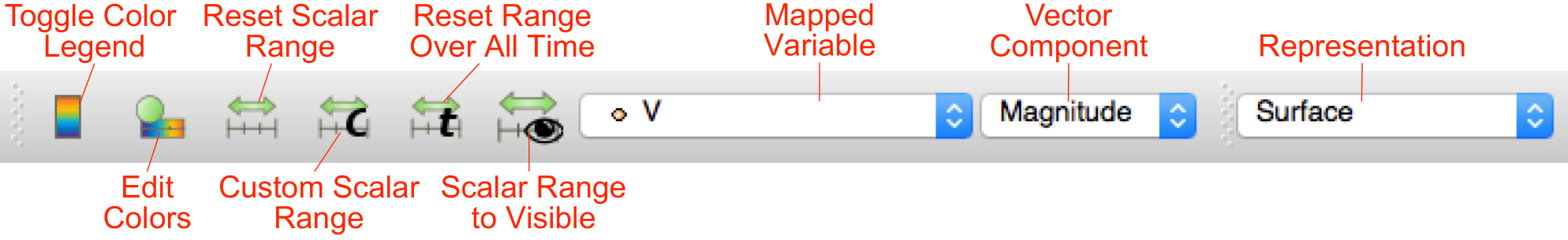
Before we continue on to filtering the data, let us take a quick look at some of the ways to represent the data. The most common parameters for representing data are located in a pair of toolbars. (They can also be found in the Display group of the properties panel.)
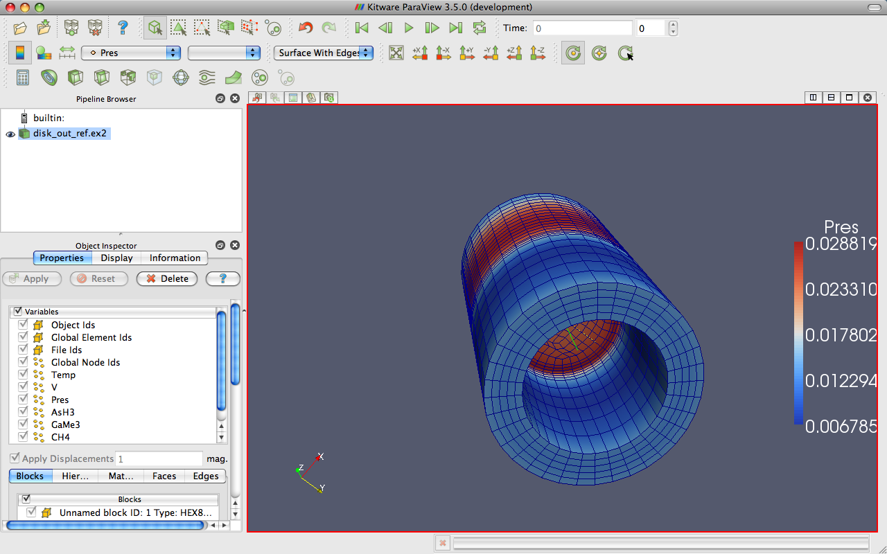
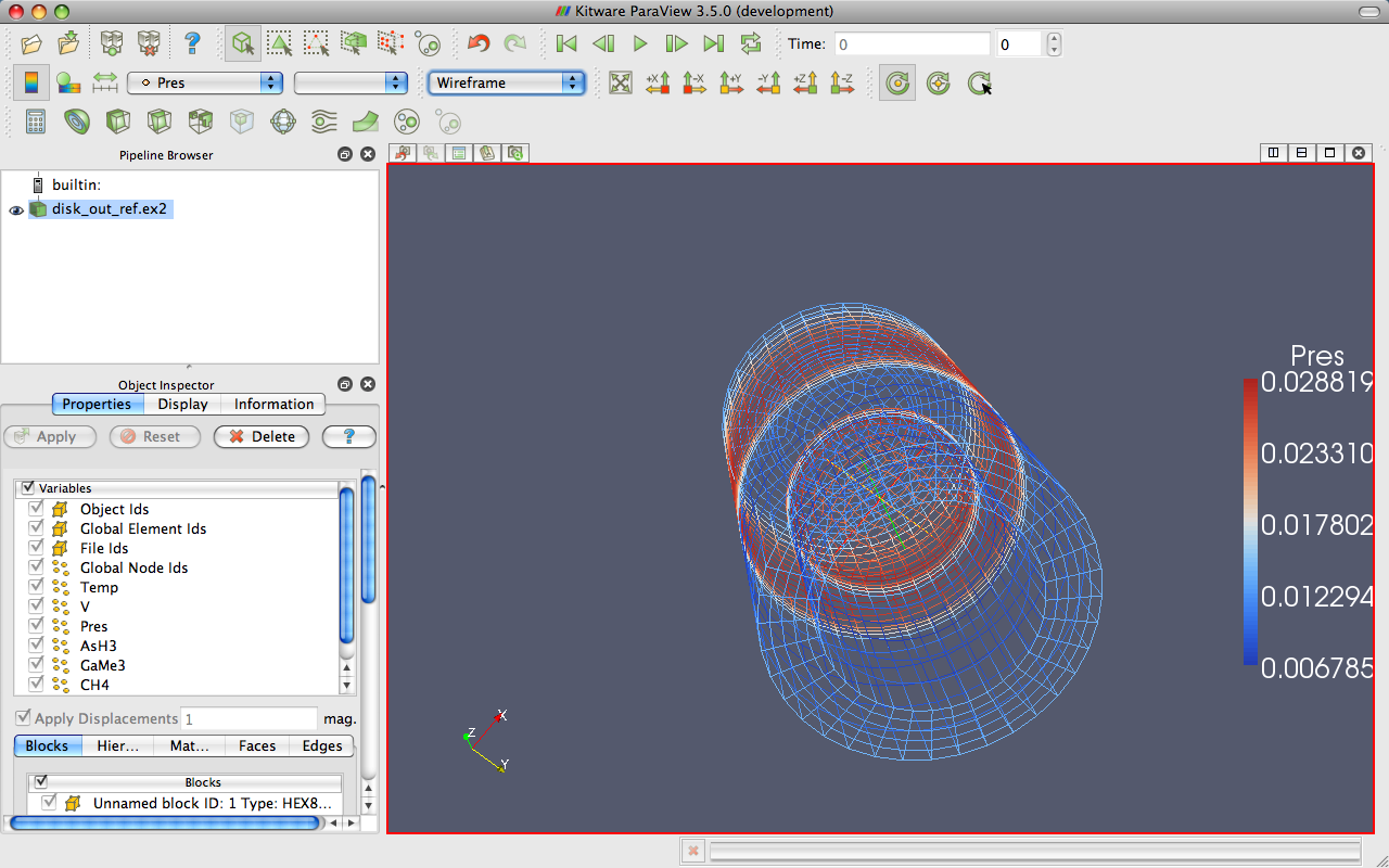
Exercise 2.8 (Representation and Field Coloring)
Play with the data representation a bit. Make sure disk_out_ref.ex2 is selected in the pipeline browser. (If you do not have the data loaded, repeat Exercise 2.7.) Use the variable chooser to color the surface by the pres variable. To see the structure of the mesh, change the representation to Surface With Edges. You can view both the cell structure and the interior of the mesh with the Wireframe representation.
|
|
|
|
2.6. Filters
We have now successfully read in some data and gleaned some information about it. We can see the basic structure of the mesh and map some data onto the surface of the mesh. However, as we will soon see, there are many interesting features about these data that we cannot determine by simply looking at the surface of these data. There are many variables associated with the mesh of different types (scalars and vectors). And remember that the mesh is a solid model. Most of the interesting information is on the inside.
We can discover much more about our data by applying filters. Filters are functional units that process the data to generate, extract, or derive features from the data. Filters are attached to readers, sources, or other filters to modify its data in some way. These filter connections form a visualization pipeline. There is a great amount of filters available in ParaView. Here are the most common, which are all available by clicking on the respective icon in the filters toolbar.
 Calculator
Evaluates a user=defined expression on a per=point or per-cell basis.
 Contour
Extracts the points, curves, or surfaces where a scalar field is equal to a user-defined value. This surface is often also called an isosurface.
 Clip
ClipIntersects the geometry with a half space. The effect is to remove all the geometry on one side of a user-defined plane.
 Slice
SliceIntersects the geometry with a plane. The effect is similar to clipping except that all that remains is the geometry where the plane is located.
 Threshold
Extracts cells that lie within a specified range of a scalar field.
 Extract Subset
Extracts a subset of a grid by defining either a volume of interest or a sampling rate.
 Glyph
GlyphPlaces a glyph, a simple shape, on each point in a mesh. The glyphs may be oriented by a vector and scaled by a vector or scalar.
 Stream Tracer
Seeds a vector field with points and then traces those seed points through the (steady state) vector field.
 Warp (vector)
Displaces each point in a mesh by a given vector field.
 Group Datasets
Combines the output of several pipeline objects into a single multi block dataset.
 Extract Level
Extract one or more items from a multiblock dataset.
These eleven filters are a small sampling of what is available in ParaView. In the Filters menu are a great many more filters that you can use to process your data. ParaView currently exposes more than one hundred filters, so to make them easier to find the Filters menu is organized into submenus.
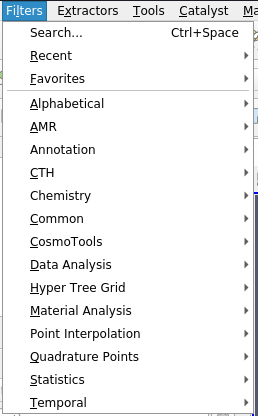
These submenus are organized as follows.
- Recent
The list of most recently used filters sorted with the most recently used filters on top.
- Favorites
The list includes your favorites filters.
- Alphabetical
An alphabetical listing of all the filters available. If you are not sure where to find a particular filter, this list is guaranteed to have it. There are also many filters that are not listed anywhere but in this list.
- AMR
A set of filters designed specifically for data in an adaptive mesh refinement (AMR) structure.
- Annotation
Filters that add annotation (such as text information) to the visualization.
- CTH
Filters used to process results from a CTH simulation.
- Chemistry
This contains filters for chemistry related datasets.
- Common
The most common filters. This is the same list of filters available in the filters toolbar and listed previously.
- CosmoTools
This contains filters developed at LANL for cosmology research.
- Data Analysis
The filters designed to retrieve quantitative values from the data. These filters compute data on the mesh, extract elements from the mesh, or plot data.
- Hyper Tree Grid
This contains filters for hyper-tree grid datasets.
- Material Analysis
Filters for processing data from volume fractions of materials.
- Point Interpolation
Filters that take an unstructured collection of points in space without cells connecting them and estimate the field interpolation between them.
- Quadrature Points
Filters to support simulation data given as integration points that can be used for numerical integration with Gaussian quadrature.
- Statistics
This contains filters that provide descriptive statistics of data, primarily in tabular form.
- Temporal
Filters that analyze or modify data that changes over time. All filters can work on data that changes over time because they are executed on each time snapshot. However, filters in this category will retrieve the available time extents and examine how data changes over time.
Searching through these lists of filters, particularly the full alphabetical list, can be cumbersome. To speed up the selection of filters, you should use the quick launch dialog. Pressing the ctrl and space keys together on Windows or Linux or the alt and space keys together on Macintosh, ParaView brings up a small, lightweight dialog box like the one shown here.
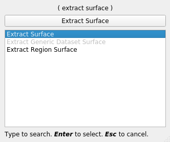
Type in words or word fragments that are contained in the filter name, and the box will list only those sources and filters that match the terms. Hit enter to add the object to the pipeline browser. Press Esc a couple of times to cancel the dialog.
You have probably noticed that some of the filters are grayed out. Many filters only work on a specific types of data and therefore cannot always be used. ParaView disables these filters from the menu and toolbars to indicate (and enforce) that you cannot use these filters.
Throughout this tutorial we will explore many filters. However, we cannot explore all the filters in this forum. Consult the Filters Menu chapter of ParaView’s on-line or built-in help for more information on each filter.
Exercise 2.9 (Apply a Filter)
Let us apply our first filter. If you do not have
the disk_out_ref.ex2 data loaded, do so now (Exercise 2.7).
Make sure that disk_out_ref.ex2 is selected in the pipeline browser and
then select the contour filter from the filter toolbar or Filters
menu. Notice that a new item is added to the pipeline filter underneath
the reader and that the properties panel updates to the parameters of
the new filter. As with reading a file, applying a filter is a two step
process (unless auto apply is enabled). After creating the filter you
get a chance to modify the parameters (which you will almost always
do) before applying the filter.
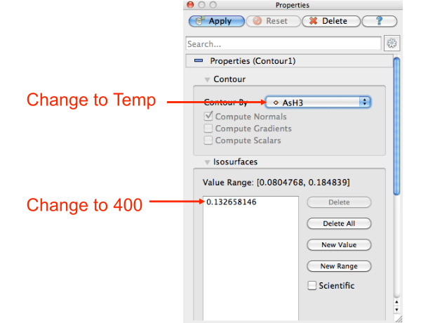
We will use the contour filter to create an isosurface where the
temperature is equal to 400 K. First, change the Contour By parameter to
the temp variable. Then, change the isosurface value to 400. Finally,
hit . You will see the isosurface appear inside of the volume. If
disk_out_ref.ex2 was still colored by pressure from Exercise 2.8,
then the surface is colored by pressure to match.

In the preceding exercise, we applied a filter that processed the data and gave us the results we needed. For most common operations, a single filter operation is sufficient to get the information we need. However, filters are of the same class as readers. That is, the general operations we apply to readers can also be applied to filters. Thus, you can apply one filter to the data that is generated by another filter. These readers and filters connected together form what we call a visualization pipeline. The ability to form visualization pipelines provides a powerful mechanism for customizing the visualization to your needs.
Let us play with some more filters. Rather than show the mesh surface in wireframe, which often interferes with the view of what is inside it, we will replace it with a cutaway of the surface. We need two filters to perform this task. The first filter will extract the surface, and the second filter will cut some away.
Exercise 2.10 (Creating a Visualization Pipeline)
The images and some of the discussion in this exercise assume you are starting with the state right after finishing Exercise 2.9. Finish that exercise before beginning this one.
Start by adding a filter that will extract the surfaces. We do that with the following steps.
Select disk_out_ref.ex2 in the pipeline browser.
From the menu bar, select Filters → Alphabetical → Extract Surface. Or bring up the quick launch (ctrl+space Win/Linux, alt+space Mac), type extract surface, and select that filter.
Hit the
button.
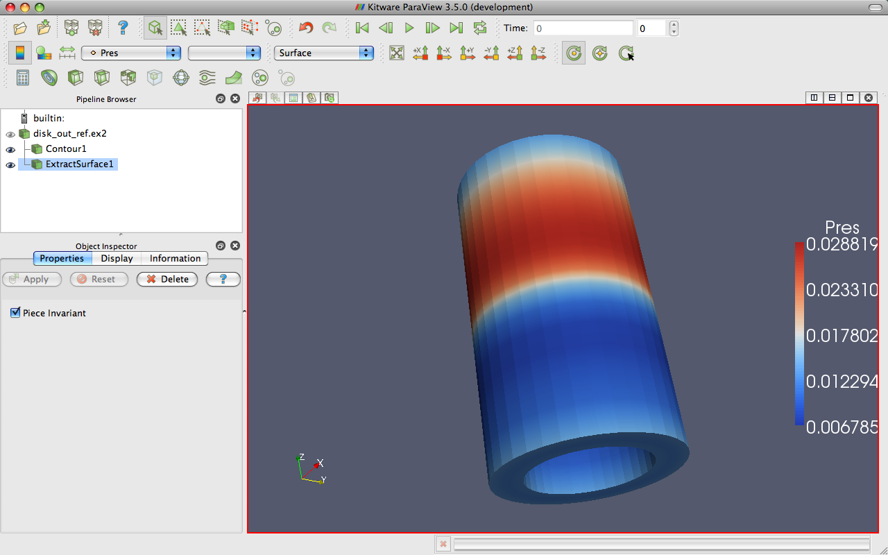
When you apply the Extract Surface filter, you will once again see the surface of the mesh. Although it looks like the original mesh, it is different in that this mesh is hollow whereas the original mesh was solid throughout.
If you were showing the results of the contour filter, you cannot see the contour anymore, but do not worry. It is still in there hidden by the surface. If you are showing the contour but you did not see any effect after applying the filter, you may have forgotten step one and applied the filter to the wrong object. If the ExtractSurface1 object is not connected directly to the disk_out_ref.ex2, then this is what went wrong. If so, you can delete the filter and try again.
Now we will cut away the external surface to expose the internal structure and isosurface underneath (if you have one).
Verify that ExtractSurface1 is selected in the pipeline browser.
Create a clip filter
from the toolbar or Filters menu.Uncheck the Show Plane checkbox
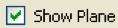 in the properties panel.
Click the
button.
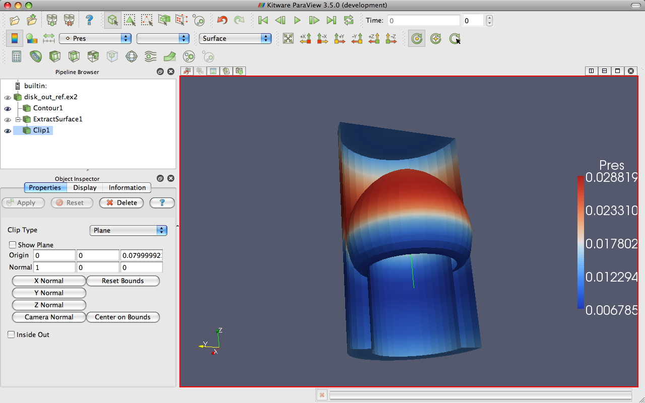
If you have a contour, you should now see the isosurface contour within a cutaway of the mesh surface. You will probably have to rotate the mesh to see the contour clearly.
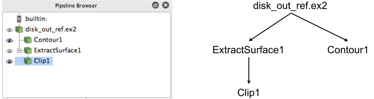
Now that we have added several filters to our pipeline, let us take a
look at the layout of these filters in the pipeline browser. The
pipeline browser provides a convenient list of pipeline objects that we
have created. This makes it easy to select pipeline objects and change
their visibility by clicking on the eyeball icons  next to them. But
also notice the indentation of the entries in the list and the
connecting lines toward the left. These features reveal the
connectivity of the pipeline. It shows the same information as the
traditional graph layout on the right, but in a much more compact space.
The trouble with the traditional layout of pipeline objects is that it
takes a lot of space, and even moderately sized pipelines require a
significant portion of the GUI to see fully. The pipeline browser,
however, is complete and compact.
next to them. But
also notice the indentation of the entries in the list and the
connecting lines toward the left. These features reveal the
connectivity of the pipeline. It shows the same information as the
traditional graph layout on the right, but in a much more compact space.
The trouble with the traditional layout of pipeline objects is that it
takes a lot of space, and even moderately sized pipelines require a
significant portion of the GUI to see fully. The pipeline browser,
however, is complete and compact.
2.7. Multiview
Occasionally in the pursuit of science we can narrow our focus down to one variable. However, most interesting physical phenomena rely on not one but many variables interacting in certain ways. It can be very challenging to present many variables in the same view. To help you explore complicated visualization data, ParaView contains the ability to present multiple views of data and correlate them together.
So far in our visualization we are looking at two variables: We are coloring with pressure and have extracted an isosurface with temperature. Although we are starting to get the feel for the layout of these variables, it is still difficult to make correlations between them. To make this correlation easier, we can use multiple views. Each view can show an independent aspect of the data and together they may yield a more complete understanding.
On top of each view is a small toolbar, and the buttons controlling the
creation and deletion of views are located on the right side of this
tool bar. There are four buttons in all. You can create a new view by
splitting an existing view horizontally or vertically with the  and
and  buttons, respectively. The
  button deletes a view, whose
space is consumed by an adjacent view. The
button deletes a view, whose
space is consumed by an adjacent view. The  temporarily fills view space
with the selected view until
temporarily fills view space
with the selected view until  is pressed.
Exercise 2.11 (Using Multiple Views)
We are going to start a fresh visualization,
so if you have been following along with the exercises so far, now is
a good time to reset ParaView. The easiest way to do this is to select
Edit → Reset Session from the menu or hit on the
toolbar. This option deletes all of your current work and resets
ParaView back to its initial state. It is roughly the equivalent of
restarting ParaView.
First, we will look at one variable. We need to see the variable through the middle of the mesh, so we are going to clip the mesh in half.
Open the file disk_out_ref.ex2, load all variables,
(see Exercise 2.7).Add the Clip filter
to disk_out_ref.ex2.Uncheck the Show Plane checkbox
in the properties panel.Click the
button.Color the surface by pressure by changing the variable chooser (in the toolbar) from vtkBlockColors to pres.
Now we can see the pressure in a plane through the middle of the mesh. We want to compare that to the temperature on the same plane. To do that, we create a new view to build another visualization.
Press the
button.
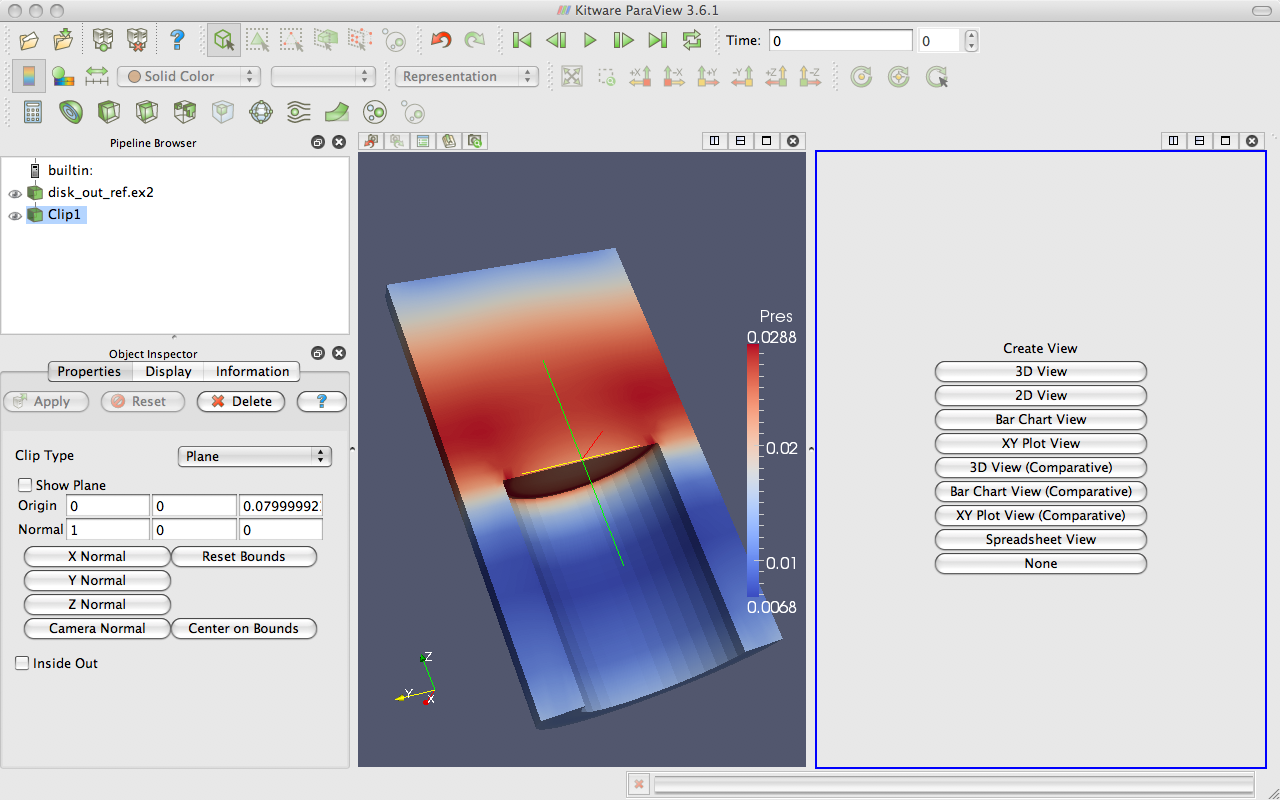
The current view is split in half and the right side is blank, ready to be filled with a new visualization. Notice that the view in the right has a blue border around it. This means that it is the active view. Widgets that give information about and controls for a single view, including the pipeline browser and properties panel, follow the active view. In this new view we will visualize the temperature of the mesh.
Make sure the blue border is still around the new, blank view (to the right). You can make any view the active view by simply clicking on it.
Turn on the visibility of the clipped data by clicking the eyeball
 next to Clip1 in the pipeline browser.
Color the surface by temperature by selecting Clip1 in the pipeline browser and changing the variable chooser (in the toolbar) from Solid Color to temp.
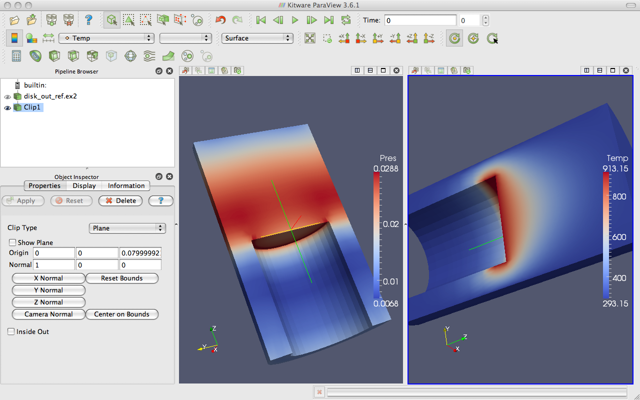
We now have two views: one showing information about pressure and the other information about temperature. We would like to compare these, but it is difficult to do because the orientations are different. How are we to know how a location in one correlates to a location in the other? We can solve this problem by adding a camera link so that the two views will always be drawn from the same viewpoint. Linking cameras is easy.
Right click on one of the views and select Link Camera… from the pop up menu. (If you are on a Mac with no right mouse button, you can perform the same operation with the menu option Tools → Add Camera Link….)
Click in the second view.
Try moving the camera in each view.
Voilà! The two cameras are linked; each will follow the other. With
the cameras linked, we can make some comparisons between the two views.
Click the  button to get a straight-on view of the cross section and
zoom in a bit.
button to get a straight-on view of the cross section and
zoom in a bit.
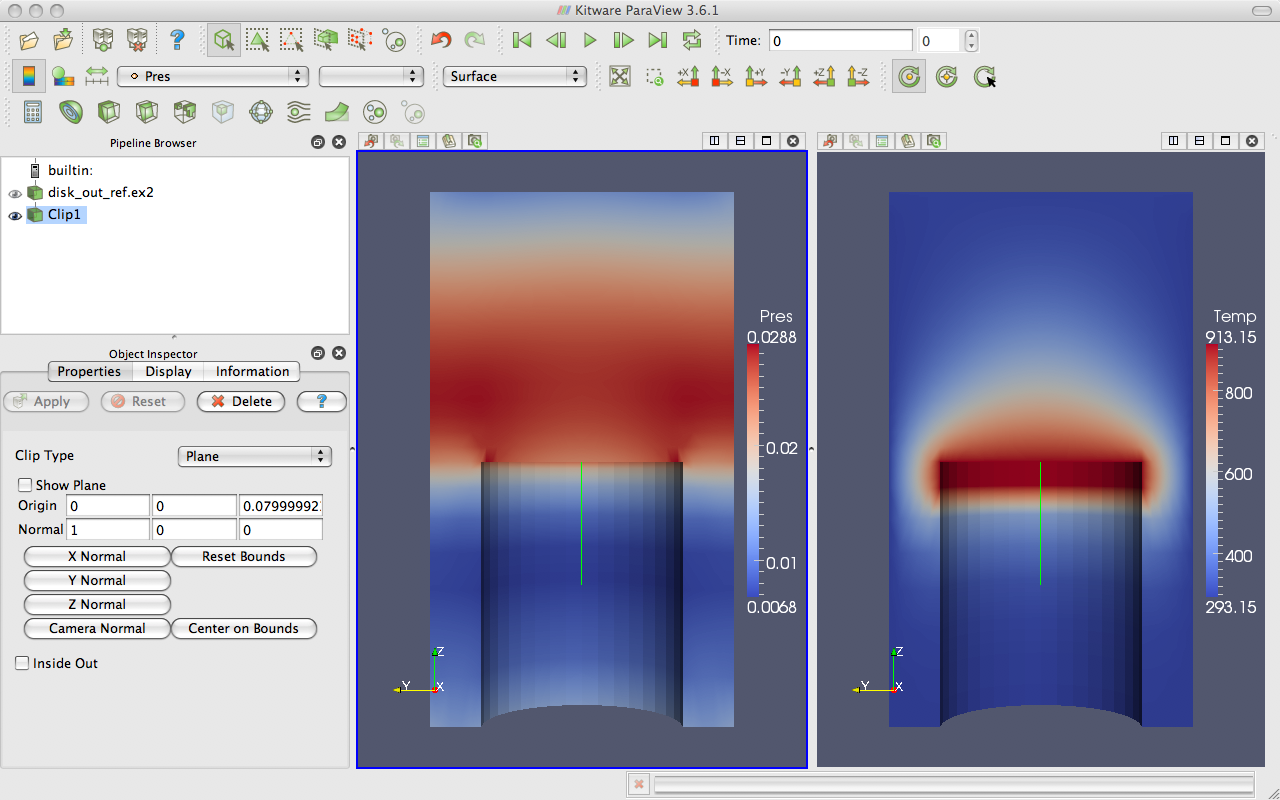
Notice that the temperature is highest at the interface with the heated disk. That alone is not surprising. We expect the air temperature to be greatest near the heat source and drop off away from it. But notice that at the same position the pressure is not maximal. The air pressure is maximal at a position above the disk. Based on this information we can draw some interesting hypotheses about the physical phenomenon. We can expect that there are two forces contributing to air pressure. The first force is that of gravity causing the upper air to press down on the lower air. The second force is that of the heated air becoming less dense and therefore rising. We can see based on the maximal pressure where these two forces are equal. Such an observation cannot be drawn without looking at both the temperature and pressure in this way.
Multiview in ParaView is of course not limited to simply two windows.
Note that each of the views has its own set of multiview buttons. You
can create more views by using the split view buttons
to arbitrarily divide up the working space. And you can
delete views at any time.
The location of each view is also not fixed. You are also able to swap two views by clicking on one of the view toolbars (somewhere outside of where the buttons are), holding down the mouse button, and dragging onto one of the other view toolbars. This will immediately swap the two views.
You can also change the size of the views by clicking on the space in between views, holding down the mouse button, and dragging in the direction of either one of the views. The divider will follow the mouse and adjust the size of the views as it moves.
2.8. Vector Visualization
Let us see what else we can learn about this simulation. The simulation has also outputted a velocity field describing the movement of the air over the heated rotating disk. We will use ParaView to determine the currents in the air.
A common and effective way to characterize a vector field is with streamlines. A streamline is a curve through space that at every point is tangent to the vector field. It represents the path a weightless particle will take through the vector field (assuming steady-state flow). Streamlines are generated by providing a set of seed points.
Exercise 2.12 (Streamlines)
We are going to start a fresh visualization, so if you have been following along with the exercises so far, now is a good time to select reset session from the toolbar.
Open the file disk_out_ref.ex2, load all variables,
(see
Exercise 2.7).Add the stream tracer filter
to disk_out_ref.ex2.Change the Seed Type parameter in the properties panel to Point Cloud.
Uncheck the Show Sphere checkbox
 in the properties
panel under the seed type.
in the properties
panel under the seed type.Click the
button to accept these parameters.
The surface of the mesh is replaced with some swirling lines. These lines represent the flow through the volume. Notice that there is a spinning motion around the center line of the cylinder. There is also a vertical motion in the center and near the edges.
The new geometry is off-center from the previous geometry. We can
quickly center the view on the new geometry with the reset camera
command. This command centers and fits the visible geometry within the
current view and also resets the center of rotation to the middle of the
visible geometry.
One issue with the streamlines as they stand now is that the lines are difficult to distinguish because there are many close together and they have no shading. Lines are a 1D structure and shading requires a 2D surface. Another issue with the streamlines is that we cannot be sure in which direction the flow is.
In the next exercise, we will modify the streamlines we created in Exercise 2.12 to correct these problems. We can create a 2D surface around our stream traces with the tube filter. This surface adds shading and depth cues to the lines. We can also add glyphs to the lines that point in the direction of the flow.
Exercise 2.13 (Making Streamlines Fancy)
This exercise is a continuation of Exercise 2.12. You will need to finish that exercise before beginning this one.
Use the quick launch (ctrl+space Win/Linux, alt+space Mac) to add the Tube filter to the streamlines.
Hit the
button.
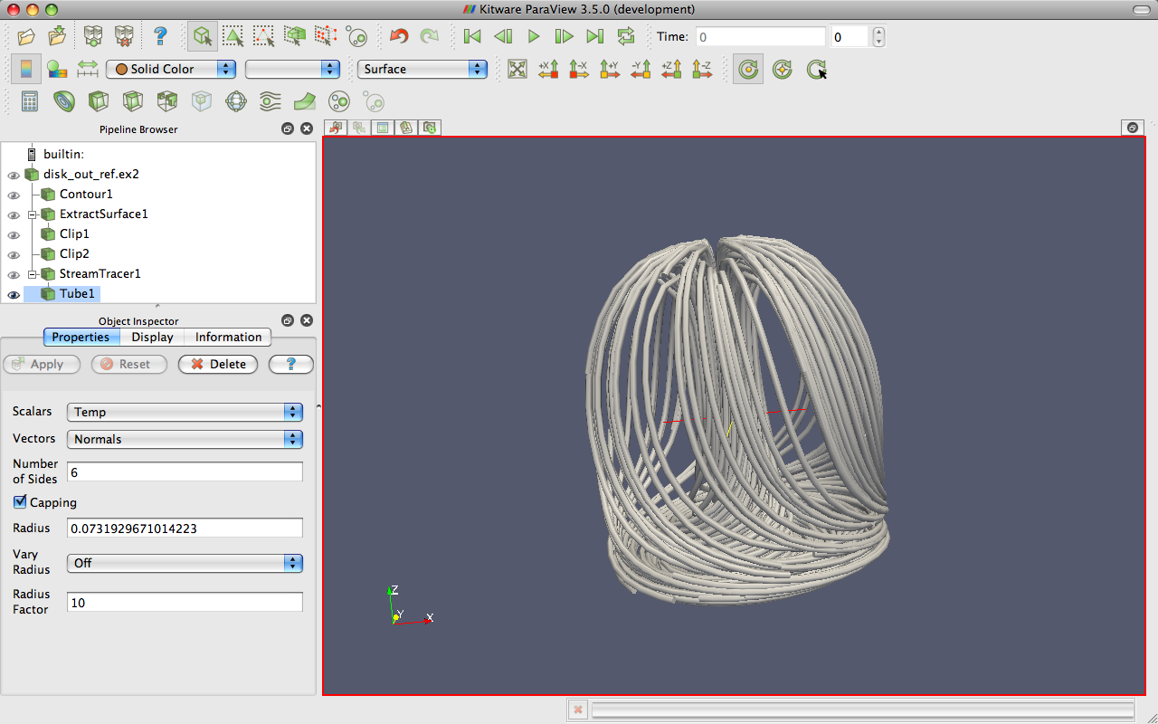
You can now see the streamlines much more clearly. As you look at the streamlines from the side, you should be able to see circular convection as air heats, rises, cools, and falls. If you rotate the streams to look down the Z axis at the bottom near where the heated plate should be, you will also see that the air is moving in a circular pattern due to the friction of the rotating disk.
(Note that as an alternative to adding the Tube filter, you can instead directly render lines as tubes. This applies a special rendering mode that renders wide lines with tube-like shading. To do this, instead of creating the Tube filter set Line Width display parameter to some value larger than 1 (say 5) and click on the Render Lines As Tubes display parameter.)
Now we can get a little fancier. We can add glyphs to the streamlines to show the orientation and magnitude.
Select StreamTracer1 in the pipeline browser.
Add the glyph filter
to StreamTracer1.In the properties panel, change the Glyph Type option to Cone.
In the properties panel, change the Orientation Array to v.
In the properties panel, change the Scale Array to v.
Click the reset
button to the right of Scale Factor.Hit the
button.Color the glyphs with the temp variable.
Now the streamlines are augmented with little pointers. The pointers face in the direction of the velocity, and their size is proportional to the magnitude of the velocity. Try using this new information to answer the following questions.
Where is the air moving the fastest? Near the disk or away from it? At the center of the disk or near its edges?
Which way is the plate spinning?
At the surface of the disk, is air moving toward the center or away from it?
2.9. Plotting
ParaView’s plotting capabilities provide a mechanism to drill down into your data to allow quantitative analysis. Plots are usually created with filters, and all of the plotting filters can be found in the Data Analysis submenu of Filters. There is also a data analysis toolbar containing the most common data analysis filters, some of which are used to generate plots.
 Compute Quartiles
Computes the quartiles for each field in the dataset and then shows a box chart depicting the quartiles.
 Extract Selection
Extracts any data selected into its own object. Selections are described in Section 2.14.
 Histogram
Allows you to generate the histogram of a data array from a dataset.
 Plot Global Variables Over Time
Datasets sometimes capture information in “global” variables that apply to an entire dataset rather than a single point or cell. This filter plots the global information over time. ParaView’s handling of time is described in Section 2.11.
 Plot Over Line
Allows you to define a line segment in 3D space and then plot field information over this line.
 Plot Selection Over Time
Takes the fields in selected points or cells and plots their values over time. Selections are described in Section 2.14 and time is described in Section 2.11.
 Probe
ProbeProvides the field values in a particular location in space.
 Programmable Filter
Allows you to program a user-defined filter. To use the filter you define a function that retrieves input of the correct type, creates data, and then manipulates the output of the filter.
In the next exercise, we create a filter that will plot the values of the mesh’s fields over a line in space.
Exercise 2.14 (Plot Over a Line in Space)
We are going to start a fresh visualization, so if
you have been following along with the exercises so far, now is a good
time to reset ParaView. The easiest way to do this is to select
from the toolbar.
Open the file disk_out_ref.ex2, load all variables,
(see
Exercise 2.7).Add the Clip filter
to disk_out_ref.ex2, Uncheck the Show
Plane and the Invert checkboxes in the properties
panel, and click (like in Exercise 2.11). This will
make it easier to see and manipulate the line we are plotting over.Click on disk_out_ref.ex2 in the pipeline browser to make that the active object.
From the toolbars, select the plot over line
filter.
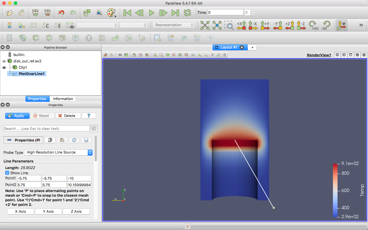
In the active view you will see a line through your data with a ball at each end. If you move your mouse over either of these balls, you can drag the balls through the 3D view to place them. If you hold down the x, y, or z key while you drag one of these balls, the movement will be constrained to that axis. Notice that each time you move the balls some of the fields in the properties panel also change. You can also place the balls by hovering your mouse over the target location and hitting the 1, 2, or p key. The 1 key will place the first ball at the surface underneath the mouse cursor. The 2 key will likewise place the second ball. The p key will alternate between placing the first and second balls. If you hold down the Ctrl modifier while hitting any of these keys, then the ball will be placed at the nearest point of the underlying mesh rather than directly under the mouse. This was the purpose of adding the clip filter: It allows us to easily add the endpoints to this plane. Note that placing the endpoints in this manner only works when rendering solid surfaces. It will not work with a volume rendered image or transparent surfaces.
This representation is called a 3D widget because it is a GUI component that is manipulated in 3D space. There are many examples of 3D widgets in ParaView. This particular widget, the line widget, allows you to specify a line segment in space. Other widgets allow you to specify points or planes.
Adjust the line so that it goes from the base of the disk straight up to the top of the mesh using the 3D widget manipulators, the p key shortcut, or the properties panel parameters. The plot works best with Point 1 around \((0,0,0)\) and Point 2 around \((0,0,10)\).
Once you have your line satisfactorily located, click the
Applybutton.
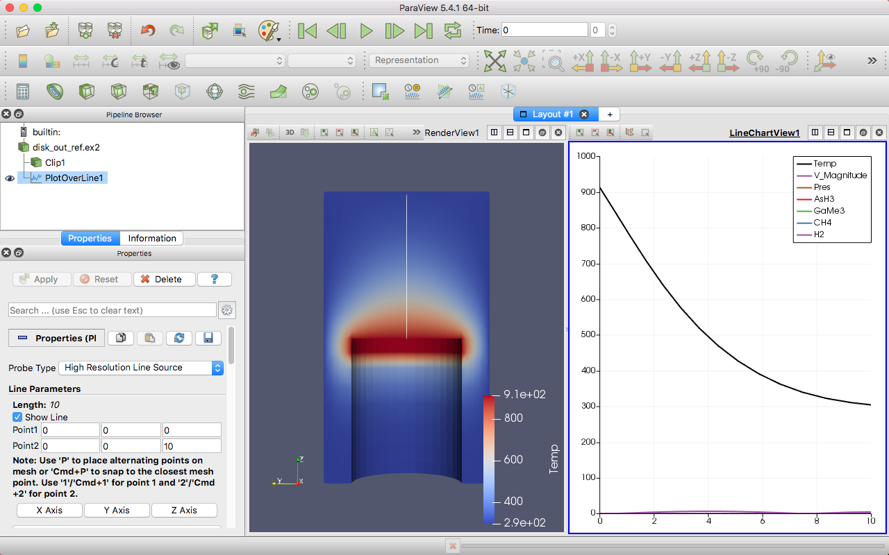
There are several interactions you can do with the plot. Roll the mouse
wheel up and down to zoom in and out. Drag with the middle button to do
a rubber band zoom. Drag with the left button to scroll the plot around.
You can also use the reset camera command to restore the
view to the full domain and range of the plot.
Plots, like 3D renderings, are considered views. Both provide a representation for your data; they just do it in different ways. Because plots are views, you interact with them in much the same ways as with a 3D view. If you look in the Display section of the properties panel, you will see many options on the representation for each line of the plot including colors, line styles, vector components, and legend names.
If you scroll down further to the View section of the properties panel, you to change plot-wide options such as labels, legends, and axes ranges.
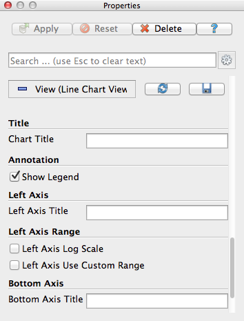
Like any other views, you can capture the plot with the File
→  Save Screenshot. Additionally, if you choose File
→ Export Scene… you can export a file with vector
graphics that will scale properly for paper-quality images. We will
discuss these image capture features later in Section 2.13.
You can also resize and swap plots in the GUI like you can other views.
Save Screenshot. Additionally, if you choose File
→ Export Scene… you can export a file with vector
graphics that will scale properly for paper-quality images. We will
discuss these image capture features later in Section 2.13.
You can also resize and swap plots in the GUI like you can other views.
In the next exercise, we modify the display to get more information out of our plot. Specifically, we use the plot to compare the pressure and temperature variables.
Exercise 2.15 (Plot Series Display Options)
This exercise is a continuation of Exercise 2.14. You will need to finish that exercise before beginning this one.
Choose a place in your GUI that you would like the plot to go and try using the split, delete, resize, and swap view features to move it there.
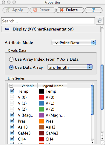
Make the plot view active, go to the Display section of the properties panel, and turn off all variables except temp and pres.
The temp and pres variables have different units. Putting them on the same scale is not useful. We can still compare them in the same plot by placing each variable on its own scale. The line plot in ParaView allows for a different scale on the left and right axis, and you can scale each variable individually on each axis.
Select the pres variable in the Display options.
Change the Chart Axis to Bottom - Right
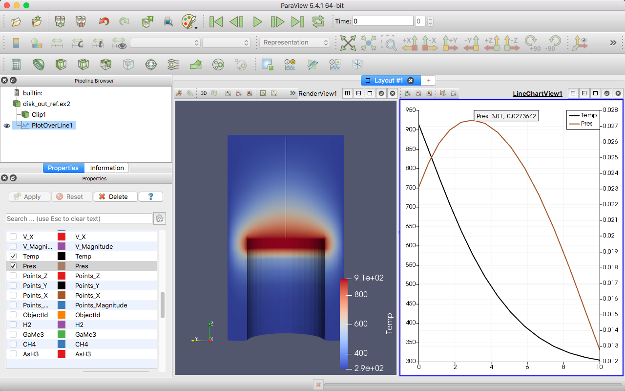
From this plot we can verify some of the observations we made in Section 2.7. We can see that the temperature is maximal at the plate surface and falls as we move away from the plate, but the pressure goes up and then back down. In addition, we can observe that the maximal pressure (and hence the location where the forces on the air are equalized) is about 3 units away from the disk.
The ParaView framework is designed to accommodate any number of
different types of views. This is to provide researchers and developers
a way to deliver new ways of looking at data. To see another example of
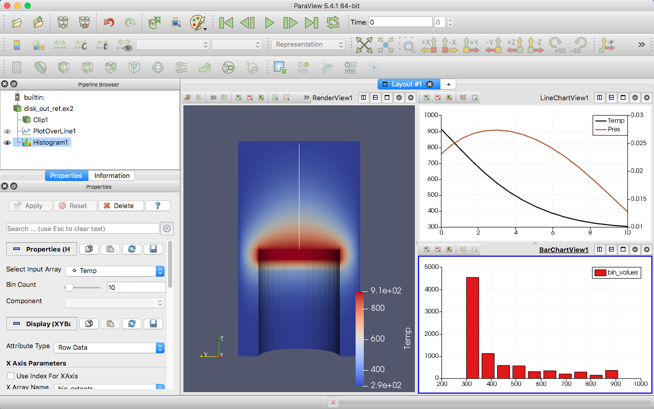
view, select disk_out_ref.ex2 in the pipeline browser, and then select
Filters → Domain → Data Analysis → Histogram . Make the histogram
for the temp variable, and then hit the button.
2.10. Volume Rendering
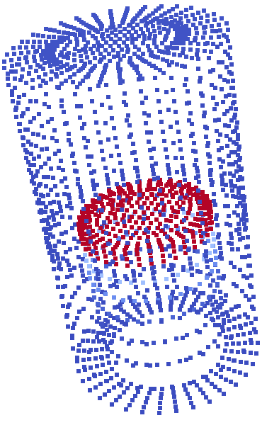
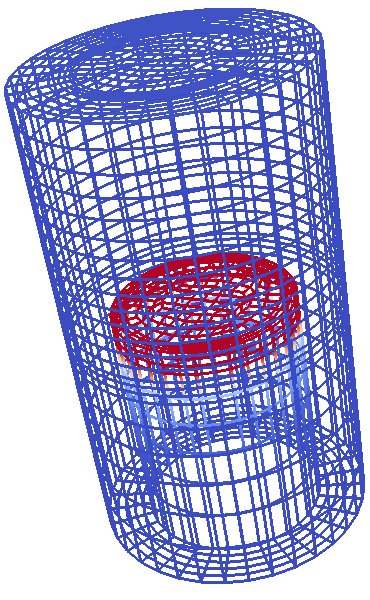
ParaView has several ways to represent data. We have already seen some examples: surfaces, wireframe, and a combination of both. ParaView can also render the points on the surface or simply draw a bounding box of the data.
|
|
|
|
|
Points |
Wireframe |
Surface |
Surface With Edges |
Volume |
A powerful way that ParaView lets you represent your data is with a technique called volume rendering. With volume rendering, a solid mesh is rendered as a translucent cloud with the scalar field determining the color and density at every point in the cloud. Unlike with surface rendering, volume rendering allows you to see features all the way through a volume.
Volume rendering is enabled by simply changing the representation of the object. Let us try an example of that now.
Exercise 2.16 (Turning On Volume Rendering)
We are going to start a fresh visualization, so
if you have been following along with the exercises so far, now is a
good time to reset ParaView. The easiest way to do this is to select
from the toolbar.
Open the file disk_out_ref.ex2, load all variables,
(see
Exercise 2.7.Make sure disk_out_ref.ex2 is selected in the pipeline browser. Change the variable viewed to temp and change the representation to Volume.
If you get an Are you sure? dialog box warning you about the change to the volume representation, click Yes to enact the change.
Show Center
of rotation.
The solid opaque mesh is replaced with a translucent volume. You may notice that when rotating your object that the rendering is temporarily replaced with a simpler transparent surface for performance reasons. We discuss this behavior in more detail later in Section 4.
A useful feature of ParaView’s volume rendering is that it can be mixed with the surface rendering of other objects. This allows you to add context to the volume rendering or to mix visualizations for a more information-rich view. For example, we can combine this volume rendering with a streamline vector visualization like we did in Exercise 2.12.
Exercise 2.17 (Combining Volume Rendering and Surface-Based Visualization)
This exercise is a continuation of Exercise 2.16. You will need to finish that exercise before beginning this one.
Add the stream tracer filter
to disk_out_ref.ex2.Change the Seed Type parameter in the properties panel to Point Cloud.
Uncheck the Show Sphere checkbox
in the properties
panel under the seed type.Click the
button to accept these parameters.
You should now be seeing the streamlines embedded within the volume rendering. The following additional steps add geometry to make the streamlines easier to see much like in Exercise 2.13. They are optional, so you can skip them if you wish.
Use the quick launch (ctrl+space Win/Linux, alt+space Mac) to apply the Tube filter and hit
.If the streamlines are colored by temp, change that to Solid Color.
Select StreamTracer1 in the pipeline browser.
Add the glyph filter
to StreamTracer1.In the properties panel, change the Glyph Type option to Cone.
In the properties panel, change the Orientation Array to v.
In the properties panel, change the Scale Array to v.
Click the reset
button to the right of Scale Factor.Hit the
button.Color the glyphs with the temp variable.
The streamlines are now shown in context with the temperature throughout the volume.
By default, ParaView will render the volume with the same colors as used
on the surface with the transparency set to 0 for the low end of the
range and 1 for the high end of the range. ParaView also provides an
easy way to change the transfer function, how scalar values are
mapped to color and transparency. You can access the transfer function
editor by selecting the volume rendered-pipeline object (in this case
disk_out_ref.ex2) and clicking on the edit color map button.
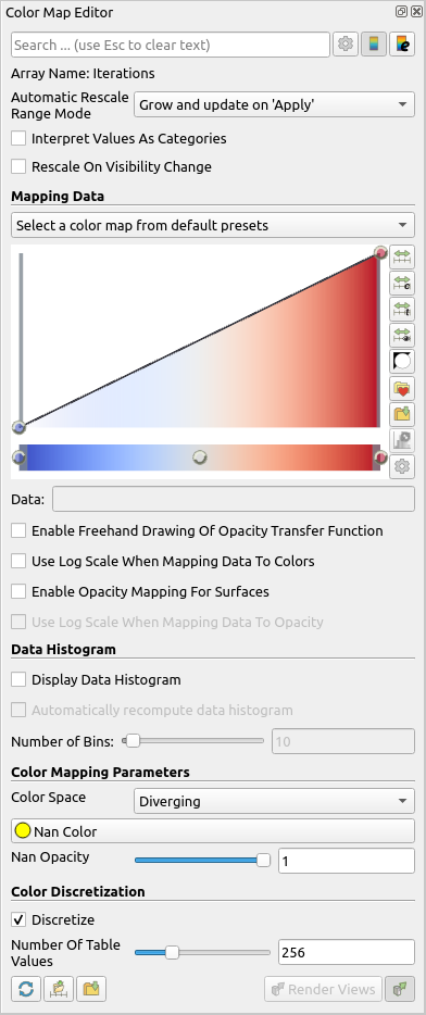
The first time you bring up the color map editor, it should appear at
the right side of the ParaView GUI window. Like most of the panels in
ParaView, this is a dockable window that you can move around the GUI or
pull off and place elsewhere on your desktop. Like the properties panel,
some of the advanced options are hidden to simplify the interface. To
access these hidden features, toggle the button in the upper
right or type a search string.
The two colorful boxes at the top represent the transfer function. The first box with a function plot with colors underneath represents the transparency whereas the long box at the bottom represents the colors. The dots on the transfer functions represent the control points. The control points are the specific color and opacity you set at particular scalar values, and the colors and transparency are interpolated between them. Clicking on a blank spot in either bar will create a new control point. Clicking on an existing control point will select it. The selected control point can be dragged throughout the box to change its scalar value and transparency (if applicable). Hitting ENTER after selecting a color control point will allow you to change the color. The selected control point will be deleted when you hit the backspace or delete key.
Did you know?
For surface rendering, the transparency controls have no effect unless “Enable opacity mapping for surfaces” is enabled.
Directly above the color and transparency bars is a text entry widget to numerically specify the Data Value of the selected control point. Below the bars are checkbox options to Use log scale when mapping data to colors, to Enable opacity mapping for surfaces, and to Automatically rescale transfer functions to fit data. (Note that this last option causes the data range to be resized under most operations that change data, but not when the time value changes. See Section 2.11 for more details.)
The following Color Space parameter changes how colors are interpolated. This parameter has no effect on the color at the control points, but can drastically affect the colors between the control points. Finally, the Nan Color allows you to select a color for “invalid” values. A NaN is a special floating point value used to represent something that is not a number (such as the result of \(0/0\)).
Setting up a transfer function can be tedious, so you can save it by
clicking the Save to preset  button. The Choose preset
  button brings up
a dialog that allows you to manage and apply the color maps that you
have created as well as many provided by ParaView.
button brings up
a dialog that allows you to manage and apply the color maps that you
have created as well as many provided by ParaView.
Exercise 2.18 (Modifying Volume Rendering Transfer Functions)
This exercise is a continuation of Exercise 2.17. You will need to finish that exercise (or minimally Exercise 2.16) before beginning this one.
Click on disk_out_ref.ex2 in the pipeline browser to make that the active object.
Click on the edit color map
button.Change the volume rendering to be more representative of heat. Press Choose preset
, select Black-Body Radiation in the
dialog box, and then click Apply followed by Close.Try adding and changing control points and observe their effect on the volume rendering. By default as you make changes the render views update. If this interactive update is too slow, you can turn off this feature by toggling the
button. When automatic updates are off,
transfer function changes are not applied until the
Render Views is clicked.
Notice that not only did the color mapping in the volume rendering change, but all the color mapping for temp changed including the cone glyphs if you created them. This ensures consistency between the views and avoids any confusion from mapping the same variable with different colors or different ranges.
While looking through the color map presents , you probably
noticed one or more entries with Rainbow as part of the title that
incorporate the colors of the a rainbow into the color map. You may also
recognize this set of colors from other visualizations you have seen in the past.

Rainbow colors are certainly a popular choice. However, we recommend that you never use rainbow color maps in your visualizations.
The problem with rainbow colors is that they have numerous perceptual properties that serve to obfuscate the data. Although we will not go into detail into the many perceptual studies that provide evidence that rainbow colors are bad for data display, we provide a brief synopsis of the problems.
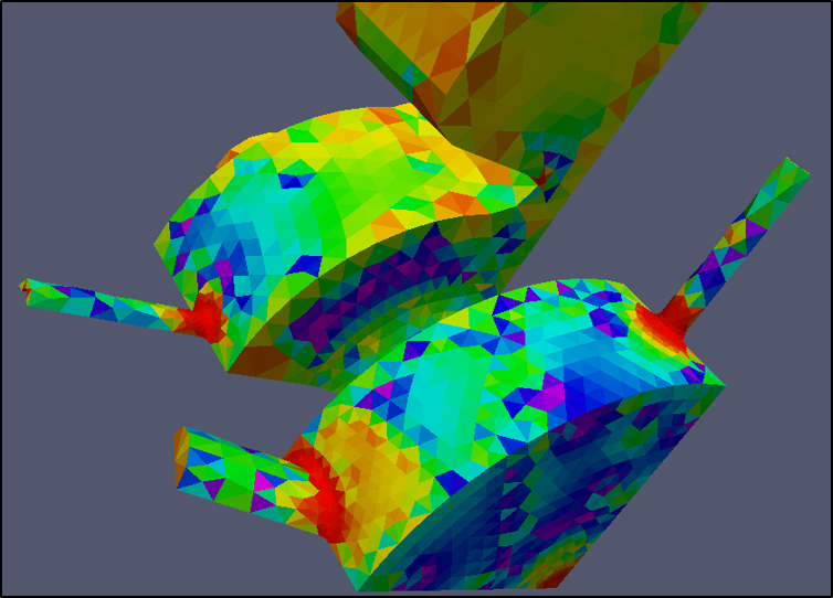
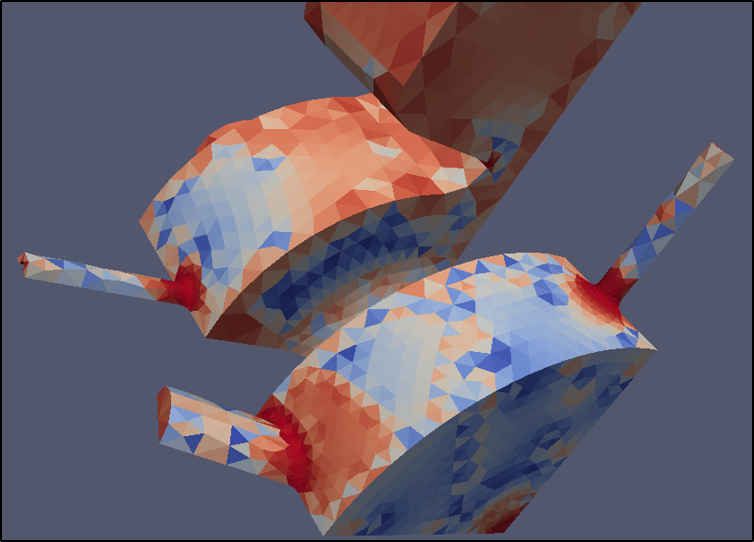
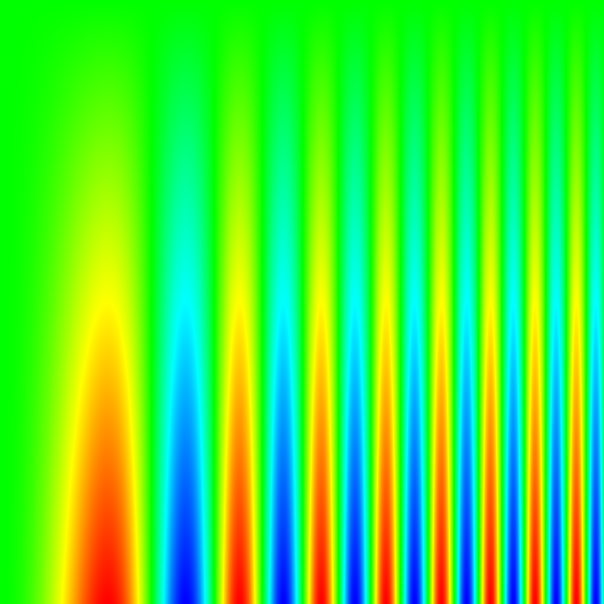
The first problem is that the colors do not follow any natural perceived ordering. Some color groups lead to a natural perception of order (with relative brightness being the strongest perceptual cue). The hues of the rainbow, however, have no real ordered meaning in our visual system. Rather, we have to learn an ordering, which can lead to visual confusion. Consider the following two example images. In the left image, the rainbow hues make it difficult to ascertain the relative high and low values that are more clear in the right image.
|
|
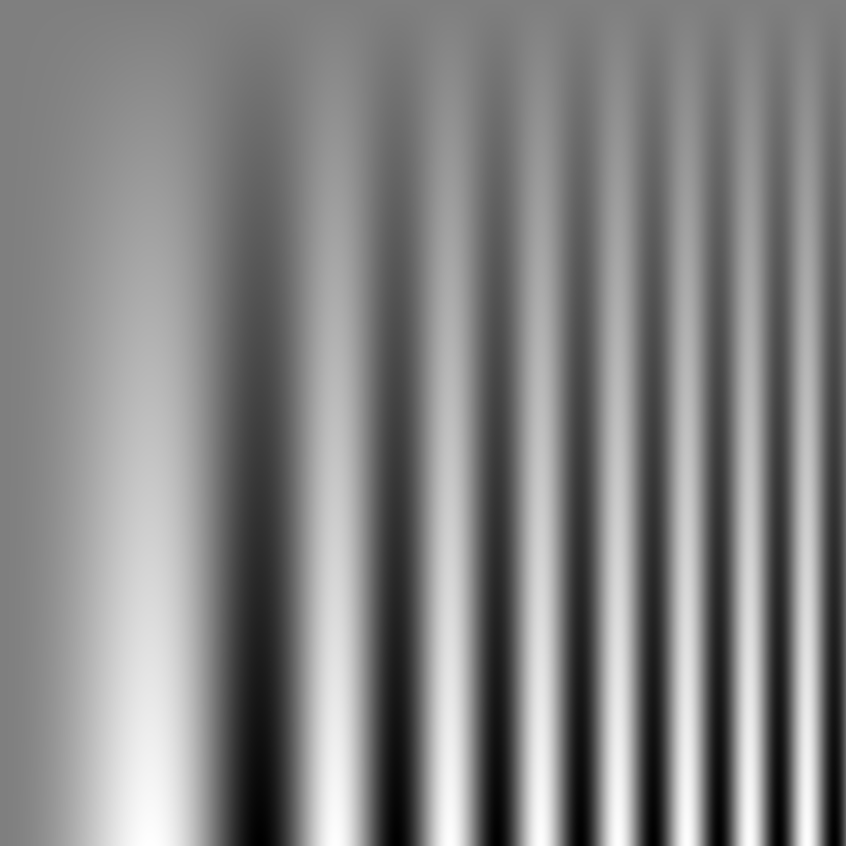
The second problem with the perception of rainbow colors is that the perceptual changes in the colors are not uniform. The colors appear to change faster in the cyan and yellow regions, which can introduce artifacts in those regions that do not exist in the data. The colors appear to change more slowly in the blue, green, and red regions, which creates larger bands of color that hide artifacts in the data. We can see this effect in the following two images of a spatial contrast sensitivity function. The grayscale on the right faithfully reproduces the function. However, the rainbow colors on the left hides the variation in low contrast regions and appears less smooth in the high-contrast regions.
|
|
A third problem with the rainbow color map is that it is sensitive to deficiencies in vision. Roughly 5% of the population cannot distinguish between the red and green colors. Viewers with color deficiencies cannot distinguish many colors considered “far apart” in the rainbow color map.
We provide this description of the problems with rainbow colors in the hopes that you do not use these color maps. Despite the well know problems with rainbow colors, they remain a popular choice. Relying on rainbow hues obfuscates data, which circumvents the entire process of data analysis that ParaView provides. Multiple perceptual studies have shown that subjects overestimate the effectiveness of rainbow colors. That is, people think they do better with rainbow colors when in fact they do worse. Don’t fall into this trap.
2.11. Time
Now that we have thoroughly analyzed the disk_out_ref simulation, we will move to a new simulation to see how ParaView handles time. In this section we will use a new dataset from another simple simulation, this time with data that changes over time.
Exercise 2.19 (Loading Temporal Data)
We are going to start a fresh visualization, so if you have been
following along with the exercises so far, now is a good time to
reset ParaView. The easiest way to do this is to select
from the toolbar.
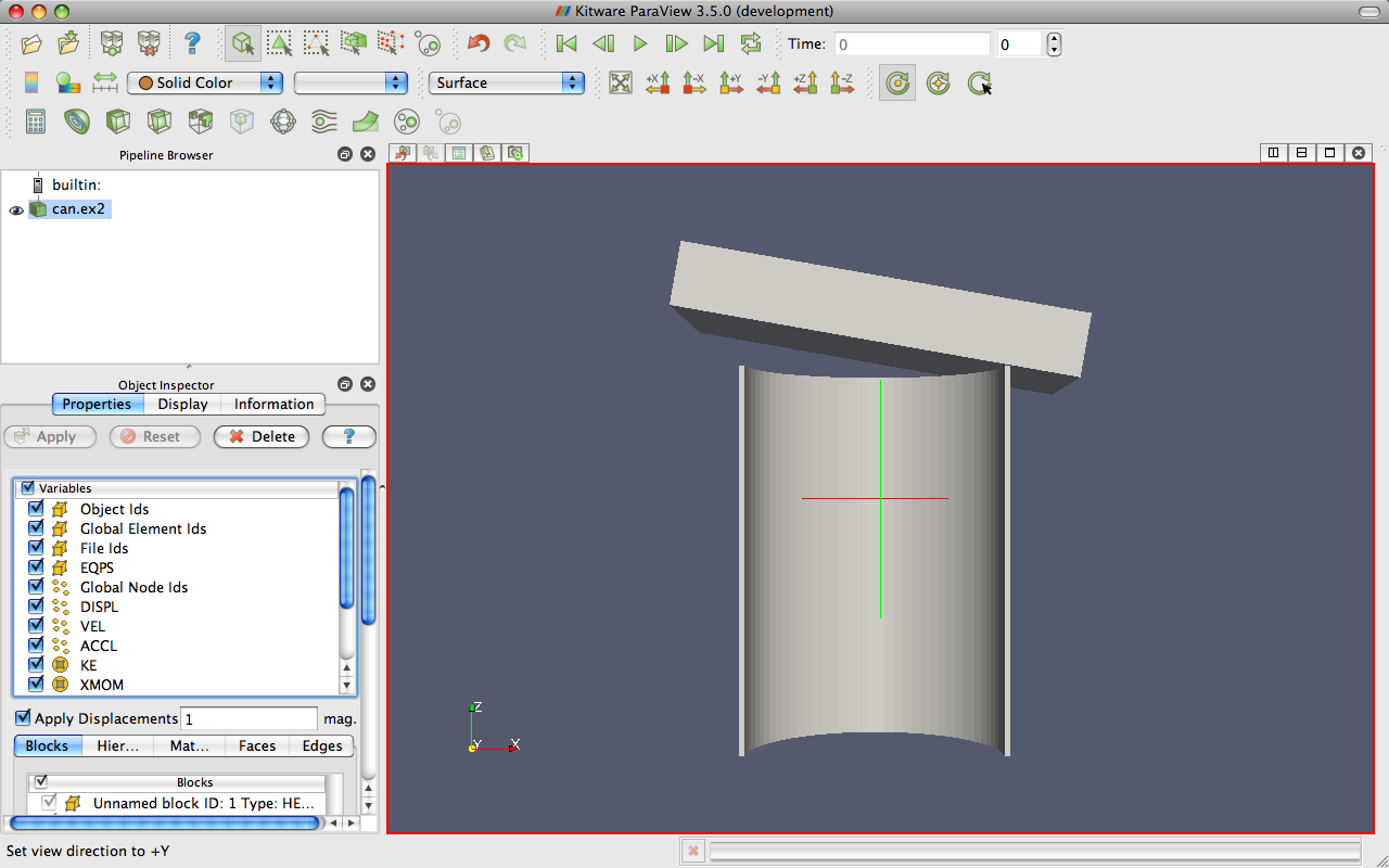
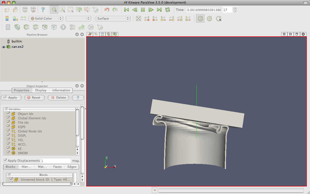
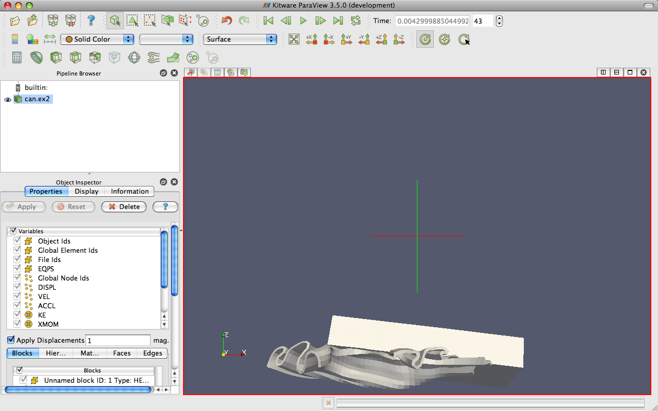
Open the file can.ex2.
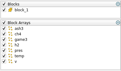
As before, click the checkbox in the header of the block arrays list to turn on the loading of all the block arrays and hit the
button.Press the
 button to orient the camera to the mesh.
Press the play button
 in the toolbars and watch ParaView
animate the mesh to crush the can with the falling brick.
in the toolbars and watch ParaView
animate the mesh to crush the can with the falling brick.
|
|
|
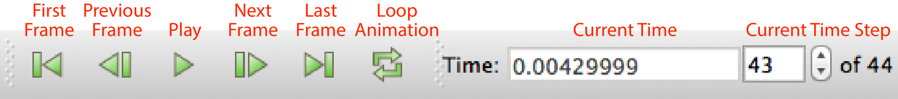
That is really all there is to dealing with data that is defined over time. ParaView has an internal concept of time and automatically links in the time defined by your data. Become familiar with the toolbars that can be used to control time.
Saving an animation is equally as easy. From the menu, select File → Save Animation. ParaView provides dialogs specifying how you want to save the animation, and then automatically iterates and saves the animation.
Exercise 2.20 (Temporal Data Pitfall)
The biggest pitfall users run into is that with mapping a set of colors whose range changes over time. To demonstrate this, do the following.
If you are not continuing from Exercise 2.19, open the file can.ex2, load all variables,
.Go to the first time step
 .
.Color by the EQPS variable.
Play
through the animation (or skip to the last time step  ).
).
The coloring is not very useful. To quickly fix the problem:
While at the last time step, click the Rescale to Data Range
 button.
Play
the animation again.
The colors are more useful now.
Although this behavior seems like a bug, it is not. It is the consequence of two unavoidable behaviors. First, when you turn on the visibility of a scalar field, the range of the field is set to the range of values in the current time step. Ideally, the range would be set to the max and min over all time steps in the data.
However, this requires ParaView to load in all of the data on the initial read, and that is prohibitively slow for large data. Second, when you animate over time, it is important to hold the color range fixed even if the range in the data changes. Changing the scale of the data as an animation plays causes a misrepresentation of the data. It is far better to let the scalars go out of the original color map’s range than to imply that they have not. There are several workarounds to this problem:
If for whatever reason your animation gets stuck on a poor color range, simply go to a representative time step and hit
.
This is what we did in the previous exercise.Open the settings dialog box accessed in the menu from Edit → Settings (ParaView → Preferences on the Mac). Under the General tab, find the option labeled Default Time Step and change it to Go to last timestep. (If you have trouble finding this option, try typing timestep into the setting’s search box.) When this is selected, ParaView will automatically go to the last time step when loading any dataset with time. For many data (such as in can), the field ranges are more representative at the last time step than at the beginning. Thus, as long as you color by a field before changing the time, the color range will be adequate.
Click the Rescale to Custom Data Range
 toolbar button. This is a
good choice if you cannot find, or do not know, a “representative”
time step or if you already know a good range to use.
toolbar button. This is a
good choice if you cannot find, or do not know, a “representative”
time step or if you already know a good range to use.If you are willing to wait or have small data, you can use the Rescale to data range over all timesteps
 toolbar
button and ParaView will compute this overall temporal range automatically.
Keep in mind that this option will require ParaView to load your entire
dataset over all time steps. Although ParaView will not hold more than
one time step in memory at a time, it will take a long time to pull all
that memory off of disk for large datasets.
toolbar
button and ParaView will compute this overall temporal range automatically.
Keep in mind that this option will require ParaView to load your entire
dataset over all time steps. Although ParaView will not hold more than
one time step in memory at a time, it will take a long time to pull all
that memory off of disk for large datasets.
ParaView has many powerful options for controlling time and animation. The majority of these are accessed through the animation view. From the menu, click on View → Animation View.
Notice
This part mention the animation view. This was replaced by the Time Manager. While the interface are quite similar, some differences may exist. Please see the ParaView User’s Guide ‘Animation’ section for more.
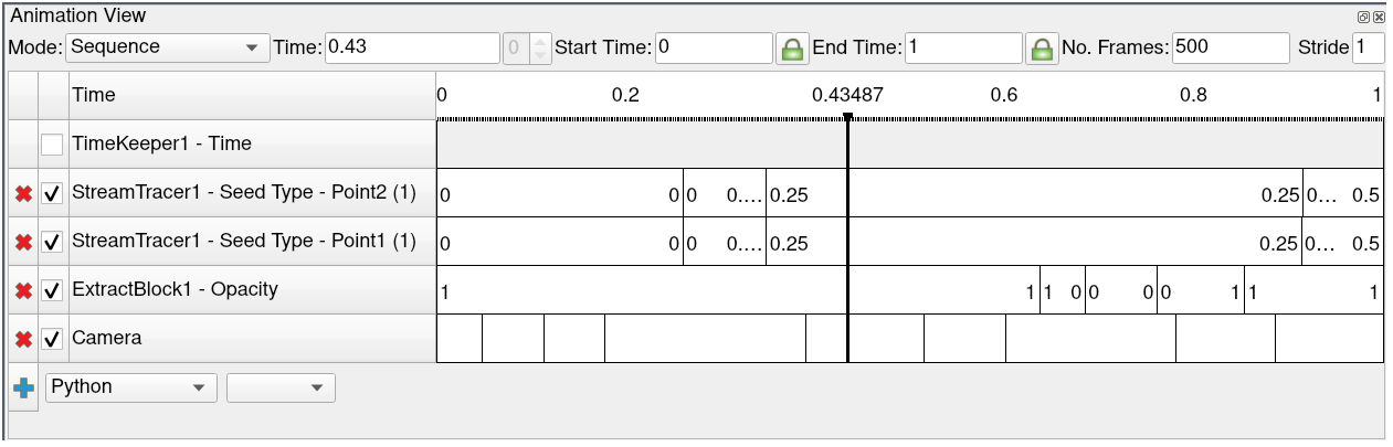
For now we will examine the controls at the top of the animation view. (We will examine the use of the tracks in the rest of the animation view later in Section 2.15.) The animation mode parameter determines how ParaView will step through time during playback. There are three modes available.
- Sequence
Given a start and end time, break the animation into a specified number of frames spaced equally apart.
- Real Time
ParaView will play back the animation such that it lasts the specified number of seconds. The actual number of frames created depends on the update time between frames.
- Snap To TimeSteps
ParaView will play back exactly those time steps that are defined by your data.
Whenever you load a file that contains time, ParaView will automatically
change the animation mode to Snap To TimeSteps. Thus, by default you can
load in your data, hit play , and see each time step as defined
in your data. This is by far the most common use case.
A counter use case can occur when a simulation writes data at variable time intervals. Perhaps you would like the animation to play back relative to the simulation time rather than the time index. No problem. We can switch to one of the other two animation modes. Another use case is the desire to change the playback rate. Perhaps you would like to speed up or slow down the animation. The other two animation modes allow us to do that.
Exercise 2.21 (Slowing Down an Animation with the Animation Mode)
We are going to start a fresh visualization, so if you have been following
along with the exercises so far, now is a good time to reset ParaView.
The easiest way to do this is to select from the toolbar.
Open the file can.ex2, load all variables,
(see Exercise 2.19).Press the
button to orient the camera to the mesh.Press the play button
in the toolbars.
During this animation, ParaView is visiting each time step in the original data file exactly once. Note the speed at which the animation plays.
If you have not done so yet, make the animation view visible: View → Animation View.
Change the animation mode to Real Time. By default the animation is set up with the time range specified by the data and a duration of 10 seconds.
Play
the animation again.
The result looks similar to the previous Snap To TimeSteps animation, but the animation is now a linear scaling of the simulation time and will complete in 10 seconds.
Change the Duration to 60 seconds.
Play
the animation again.
The animation is clearly playing back more slowly. Unless your computer is updating slowly, you will also notice that the animation appears jerkier than before. This is because we have exceeded the temporal resolution of the dataset.
Often showing the jerky time steps from the original data is the desired behavior; it is showing you exactly what is present in the data. However, if you wanted to make an animation for a presentation, you may want a smoother animation.
There is a filter in ParaView designed for this purpose. It is called the temporal interpolator. This filter will interpolate the positional and field data in between the time steps defined in the original dataset.
Exercise 2.22 (Temporal Interpolation)
This exercise is a continuation of Exercise 2.21. You will need to finish that exercise before beginning this one.
Make sure can.ex2 is highlighted in the pipeline browser.
Select Filters → Temporal → Temporal Interpolator or apply the Temporal Interpolator filter using the quick launch (ctrl+space Win/Linux, alt+space Mac).
- .
Split the view
, show the TemporalInterpolator1 in one, show
can.ex2 in the other, and link the cameras.Play
the animation.
You should notice that the output from the temporal interpolator animates much more smoothly than the original data.
It is worth noting that the temporal interpolator can (and often does) introduce artifacts in the data. It is because of this that ParaView will never apply this type of interpolation automatically; you will have to explicitly add the Temporal Interpolator. In general, mesh deformations often interpolate well but moving fields through a static mesh do not. Also be aware that the Temporal Interpolator only works if the topology remains consistent. If you have an adaptive mesh that changes from one time step to the next, the Temporal Interpolator will give errors.
2.12. Text Annotation
When using ParaView as a communication tool it is often helpful to annotate the images you create with text. With ParaView it is very easy to create text annotation wherever you want in a 3D view. There is a special text source that simply places some text in the view.
Exercise 2.23 (: Adding Text Annotation)
- If you are continuing this exercise after finishing Exercise 2.22,
feel free to simply continue. If you have had to restart ParaView since or your state does not match up well enough, it is also fine to start with a fresh state using
.
Use the quick launch (ctrl+space Win/Linux, alt+space Mac) to create the Text source (or from the menu bar Sources → Annotation → Text) and hit
.In the text edit box of the properties panel, type a message.
Hit the
button.
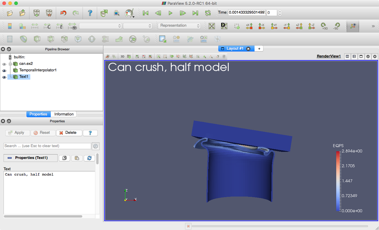
The text you entered appears in the 3D view. If you scroll down to the Display options in the properties panel, you will see six buttons that allow you to quickly place the text in each of the four corners of the view as well as centered at the top and bottom.
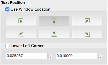
You can place this text at an arbitrary position by clicking the Lower Left Corner checkbox. With the Lower Left Corner option checked, you can use the mouse to drag the text to any position within the view.
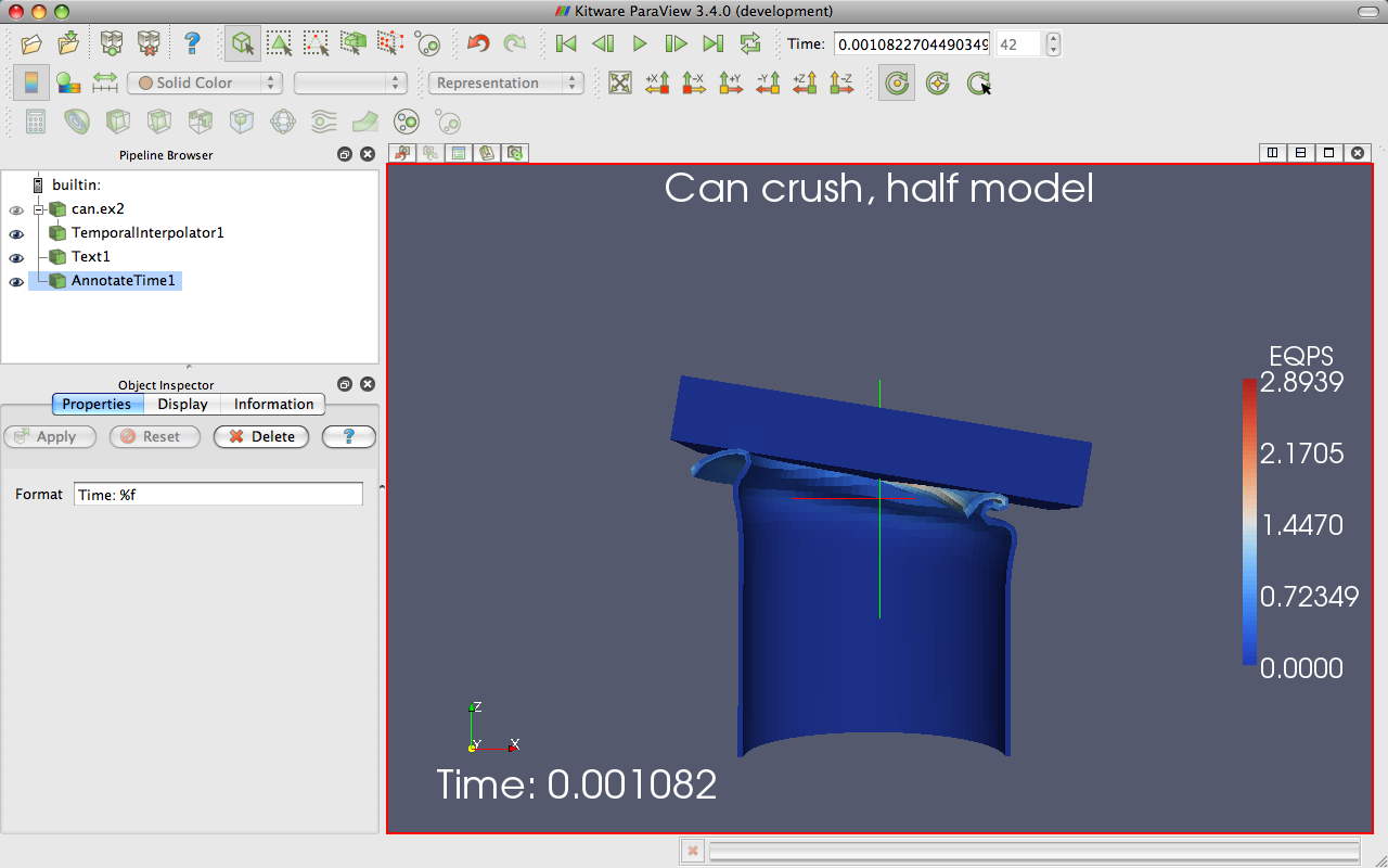
Often times you will need to put the current time value into the text annotation. Typing the correct time value can be tedious and error prone with the standard text source and impossible when making an animation. Therefore, there is a special annotate time source that will insert the current animation time into the string.
Exercise 2.24 (Adding Time Annotation)
If you do not already have it loaded from a previous exercise, open the file can.ex2,
.Add an Annotate Time source (Sources → Annotate → Annotate Time or use the quick launch: ctrl+space Win/Linux, alt+space Mac).
.Move the annotation around as necessary.
Play
and observe how the time annotation changes.
There are instances when the current animation time is not the same as the time step read from a data file. Often it is important to know what the time stored in the data file is, and there is a special version of annotate time that acts as a filter.
Select can.ex2 in the pipeline browser.
Use the quick launch (ctrl+space Win/Linux, alt+space Mac) to apply the Annotate Time Filter.
- .
Move the annotation around as necessary.
Check the animation mode in the Animation View. If it is set to Snap to TimeSteps, change it to Real Time.
Play
and observe how the time annotation changes.
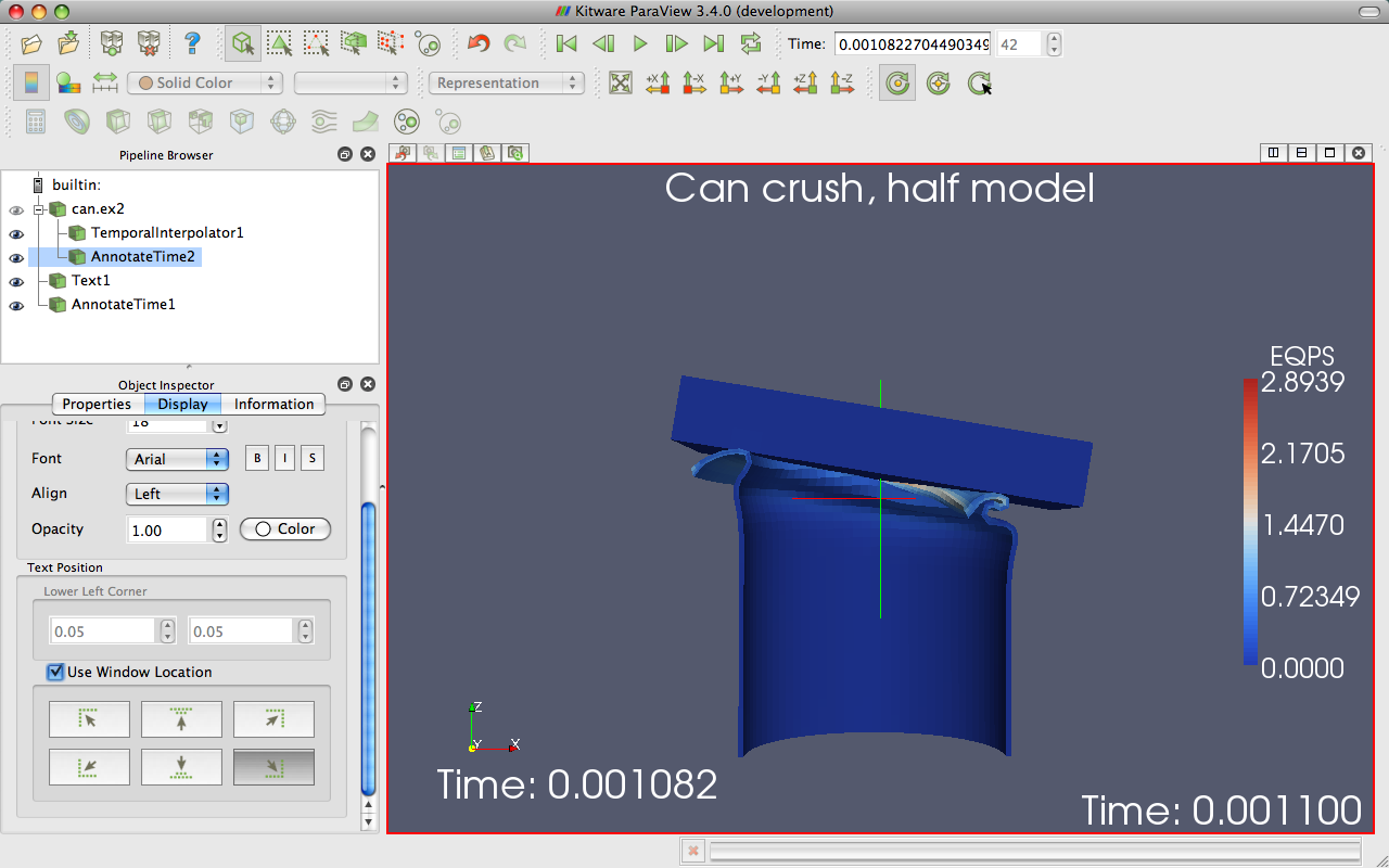
You can close the animation view. We are done with it for now, but we will revisit it again in Section 2.15.
2.13. Save Screenshot and Save Animation
One of the most important products of any visualization is screenshots and movies that can be used in presentations and reports. In this section we save a screenshot (picture) and animation (movie). Once again, we will use the can.ex2 dataset.
Exercise 2.25 (Save Screenshot)
We are going to start a fresh visualization, so if
you have been following along with the exercises so far, now is a good
time to reset ParaView. The easiest way to do this is to select
from the toolbar.
Open the file can.ex2, load all variables,
(see
Exercise 2.19).Press the
button to orient the camera to the mesh.Color by points’ ids. We use points’ ids so that the 3D object has some color.
Select File → Save Screenshot
.
This brings us to the file selection screen. If you pull down the menu Files of type: at the bottom of the dialog box, you will see several file types supported including portable network graphics (PNG), and joint photographic experts group (JPEG).
Select a File name for your file, and place it somewhere you can later find and delete. We usually recommend saving images as PNG files. The lossy compression of JPEG often creates noticeable artifacts in the images generated by ParaView, and the compression of PNG is better than most other raster formats.
Press the OK button.
After you select a file, you will be presented with a dialog box for more screenshot options.
The Save Screenshot Options dialog box includes numerous important controls.
At the top of the dialog box are Size and Scaling options. The Image
Resolution options allow you to create an image that is larger (or
smaller) than the current size of the 3D view. You can directly enter a
resolution or use the x2 and /2 buttons to double or halve the
resolution. The  button toggles locking the aspect ratio when selecting
an image resolution. The button restores the resolution to that of the
view in the GUI. If you have multiple views open, there is also a Save
All Views checkbox that toggles between saving only the active view and
saving all views in one image.
button toggles locking the aspect ratio when selecting
an image resolution. The button restores the resolution to that of the
view in the GUI. If you have multiple views open, there is also a Save
All Views checkbox that toggles between saving only the active view and
saving all views in one image.
The Coloring controls modify how some elements, such as the background, get colored. The Override Color Palette pulldown menu allows a user to use the default color scheme, one with a white color motif for printing, or other defined palettes. These are the same palettes described in Exercise 2.5. There is also a Transparent Background checkbox that adds an alpha channel to the written image (in formats that support it).
There are also many advanced options that, as always are accessible via
the button or the search bar.
Press the OK button.
Using your favorite image viewer, find and load the image you created. If you have no image viewer, ParaView itself is capable of loading PNG files.
Next, we will save an animation.
Exercise 2.26 (Save Animation)
If you do not already have it loaded from the previous exercise, open the file can.ex2, load all variables, and
(see Exercise 2.19).Select File → Save Animation
 .
.
This brings us to the file selection screen. If you pull down the menu Files of type: at the bottom of the dialog box, you will see the several file types including Ogg/Theora, AVI, JPEG, and PNG.
Select a File name for your file, and place it somewhere you can later find and delete. AVI will create a movie format that can be used on windows, and with some open source viewers. Ogg/Theora is used in many open source viewers. Otherwise, you can create a flipbook, or series of images. These images can be stitched together to form a movie using numerous open source tools. For now, try creating an AVI.
Press the OK button.
The Save Animation Options dialog box looks essentially the same as the
Save Screenshot Options dialog for screenshots. If you look at the
advanced options , you may note that there are some added
Animation Options that allow you to control the frame rate and narrow
the time steps that will be animated.
Press the OK button.
Using your favorite movie viewer, find and load the image you created.
2.14. Selection
The goal of visualization is often to find the important details within a large body of information. ParaView’s selection abstraction is an important simplification of this process. Selection is the act of identifying a subset of some dataset. There are a variety of ways that this selection can be made, most of which are intuitive to end users, and a variety of ways to display and process the specific qualities of the subset once it is identified.
More specifically the subset identifies particular select points, cells, or blocks within any single dataset. There are multiple ways of specifying which elements to include in the selection including identifier lists of multiple varieties, spatial locations, and scalar values and scalar ranges.
In ParaView, selection can take place at any time, and the program maintains a current selected set that is linked between all views. That is, if you select something in one view, that selection is also shown in all other views that display the same object.
The most direct means to create a selection is via the Find Data  panel. Launch this dialog from the toolbar or the Edit menu. From this
dialog you can enter characteristics of the data that you are searching
for. For example, you could look for points whose velocity magnitude is
near terminal velocity. Or you could look for cells whose strain exceeds
the failure of the material. The following exercise provides a quick
example of using the Find Data panel box.
panel. Launch this dialog from the toolbar or the Edit menu. From this
dialog you can enter characteristics of the data that you are searching
for. For example, you could look for points whose velocity magnitude is
near terminal velocity. Or you could look for cells whose strain exceeds
the failure of the material. The following exercise provides a quick
example of using the Find Data panel box.
Exercise 2.27 (Performing Query-Based Selections)
In this exercise we will find all cells with a large equivalent plastic strain (EQPS).
We are going to start a fresh visualization, so if you have been
following along with the exercises so far, now is a good time to reset
ParaView. The easiest way to do this is to select from the toolbar.
Open the file can.ex2, load all variables,
(see Exercise 2.19).Go to the last time step
.Open the find data panel
.From the Data Producer combo box, choose can.ex2.
From the Element Type combo box, choose Cell.
In the third row of widgets, choose EQPS from the first combo box, is \(>=\) from the second combo box, and enter 1.5 in the final text box.
Click the Find Data button.
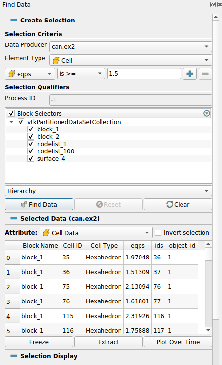
Observe the spreadsheet below the Find Data button that gets populated with the results of your query. Each row represents a cell and each column represents a field value or property (such as an identifier).
You may also notice that several cells are highlighted in the 3D view of the main ParaView window. These highlights represent the selection that your query created. Close the Find Data panel and note that the selection remains.
Another way of creating a selection is to pick elements right inside the 3D view. Most of the 3D view selections are performed with a rubber-band selection. That is, by clicking and dragging the mouse in the 3D view, you will create a boxed region that will select elements underneath it. There are also some 3D view selections that allow you to select within a polygonal region drawn on the screen. There are several types of interactive selections that can be performed, and you initiate one by selecting one of the icons in the small toolbar over the 3D view or using one of the shortcut keys. The following 3D selections are possible.
 Select Cells On (Surface)
Selects cells that are visible in the view under a rubber band. (Shortcut: s)
 Select Points On (Surface)
Selects points that are visible in the view under a rubber band. (Shortcut: d)
 Select Cells Through (Frustum)
Selects all cells that exist under a rubber band. (Shortcut: f)
 Select Points Through (Frustum)
Selects all points that exist under a rubber band. (Shortcut: g)
 Select Cells With Polygon
Like Select Cells On except that you draw a polygon by dragging the mouse rather than making a rubber-band selection.
 Select Points With Polygon
Like Select Points On except that you draw a polygon by dragging the mouse rather than making a rubber-band selection.
 Select Blocks
Selects blocks in a multiblock dataset. (Shortcut: b)
 Select Blocks Through (Frustum)
Selects all blocks of a multiblock dataset that exist under a rubber band. (Shortcut: n)
 Interactively Select Cells
Enter an interactive selection mode where cells are highlighted as the mouse hovers over them and selected when clicked.
 Interactively Select Points
Enter an interactive selection mode where points are highlighted as the mouse hovers near them and selected when clicked.
In addition to these selection modes, there are a hover point  query mode
and a hover cell
query mode
and a hover cell  query mode that allow you to quickly inspect the field
values at a visible point by hovering the mouse over it. There is also a
clear selection button that will remove the current selection.
query mode that allow you to quickly inspect the field
values at a visible point by hovering the mouse over it. There is also a
clear selection button that will remove the current selection.
Several of the selection modes have shortcut keys that allow you to make selections more quickly. Use them by placing the mouse cursor somewhere in the currently selected 3D view and hitting the appropriate key. Then click on the cell or block you want selected (or drag a rubber band over multiple elements).
Feel free to experiment with the selections now.
You can manage your selection with the Find Data panel even if the
selection was created with one of these 3D interactions rather than
directly with a find data query. The find data panel allows you to view
all the points and cells in the selection as well as perform simple
operations on the selection. These include inverting the selection (a
checkbox just over the spreadsheet), adding labels (Exercise 2.29),
freezing selections (Exercise 2.28),
and shortcuts for the Plot Selection Over Time and
Extract Selection filters (Exercise 2.30 and
Exercise 2.31, respectively).
Experiment with selections in Find Data a bit. Open the Find Data
panel. Then make selections using the rubber-band selection and see
the results in the Find Data panel. Also experiment with altering
the selection by inverting selections with the Invert selection
checkbox.
It should be noted that selections can be internally represented in different ways. Some are recorded as a list of data element ids. Others are specified as a region in space or by query parameters. Although the selections all look the same, they can behave differently, especially with respect to changes in time. The following exercise demonstrates how these different selection mechanisms can behave differently.
Exercise 2.28 (Data Element Selections vs. Spatial Selections)
If you do not already have it loaded from the previous exercise, open the file can.ex2, load all variables,
(see Exercise 2.19).Make a selection using the Select Cells Through
tool.If it is not already visible, show the Find Data
panel.
Play
the animation a bit. Notice that the region remains fixed and
the selection changes based on what cells move in or out of the
region.Go to a timestep where some data are selected. In the Find Data panel, click the Freeze Selection button.
Play
again. Notice that the cells selected are fixed regardless of
position.
In summary, a spatial selection (created with one of the select through tools) will re-perform the selection at each time step as elements move in and out of the selected region. Likewise, other queries such as field range queries will also re-execute as the data changes. However, when you select the Freeze Selection button, ParaView captures the identifiers of the currently selected elements so that they will remain the same throughout the animation.
The spreadsheet in the find panel provides a readable way to inspect field data. However, sometimes it is helpful to place the field data directly in the 3D view. The next exercise describes how we can do that.
Exercise 2.29 (Labeling Selections)
If you do not already have it loaded from the previous exercise, open the file can.ex2, load all variables,
(see Exercise 2.19).Go to the last time step
.If it is not already visible, show the Find Data
panel.Using the controls at the top of the find data panel, create a selection where cells’ ids is min. Click Find Data.
In the Cell Labels chooser, select EQPS.
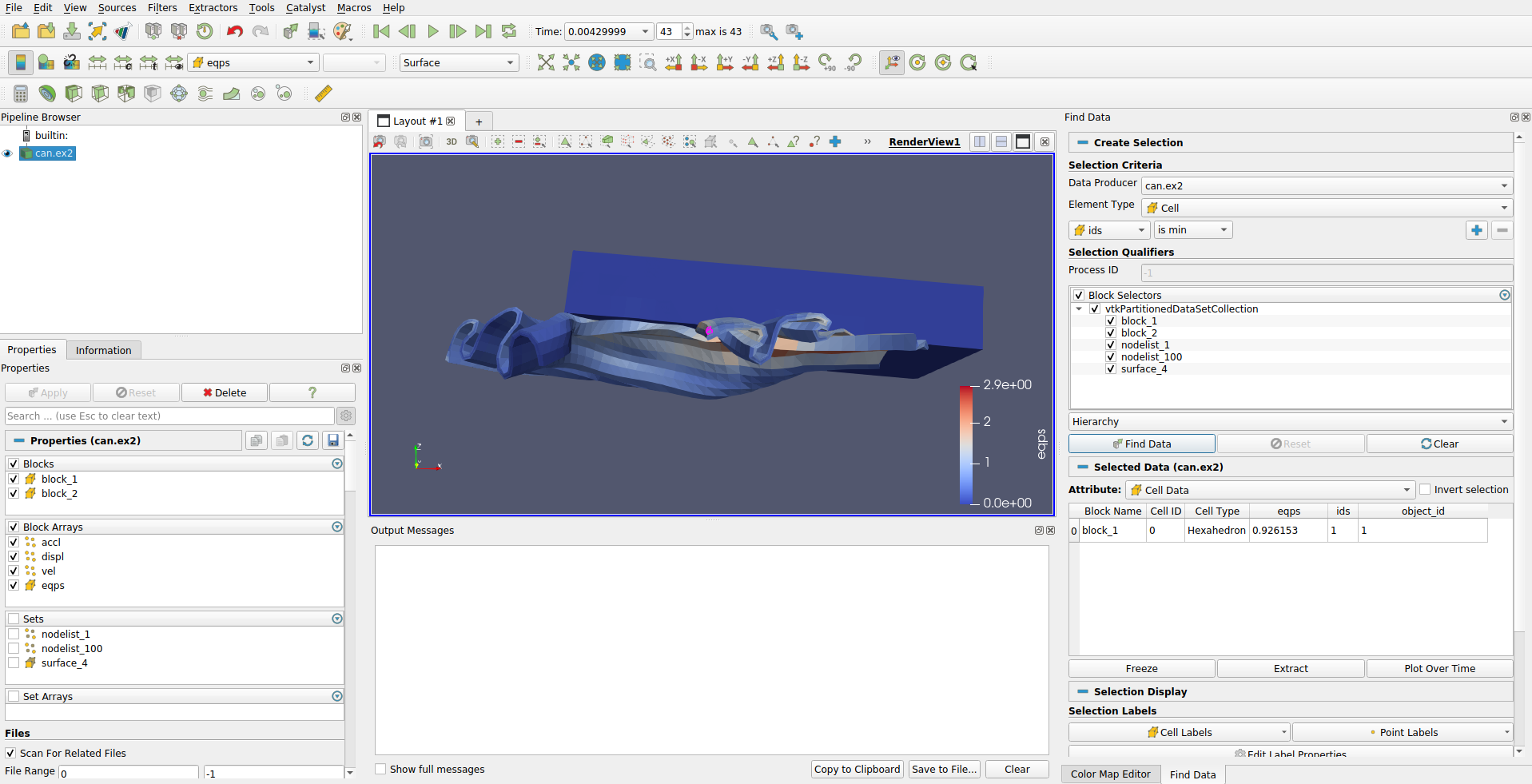
ParaView places the values for the EQPS field near the selected cell
that contains that value. You should be able to see it in the 3D view.
It is also possible to change the look of the font with respect to type,
size, and color by clicking the button below the
label choosers.
When you are done, turn off the labels by unchecking the entry in the Cell Labels chooser.
ParaView provides the ability to plot field data over time. These plots
can work on a selection, and to make this easier the Find Data panel
contains convenience controls to create them.
Exercise 2.30 (Plot Over Time)
If you do not already have it loaded from the previous exercise, open the file can.ex2, load all variables,
(see Exercise 2.19).If it is not already visible, show the Find Data
panel.Using the controls at the top of the find data panel, create a selection where EQPS is max. Click Find Data.
Click the Plot Selection Over Time button at the bottom of the find data panel to add that filter. This filter is also easily accessible by the
toolbar button in the main ParaView window.In the properties panel in the main ParaView window, click
.
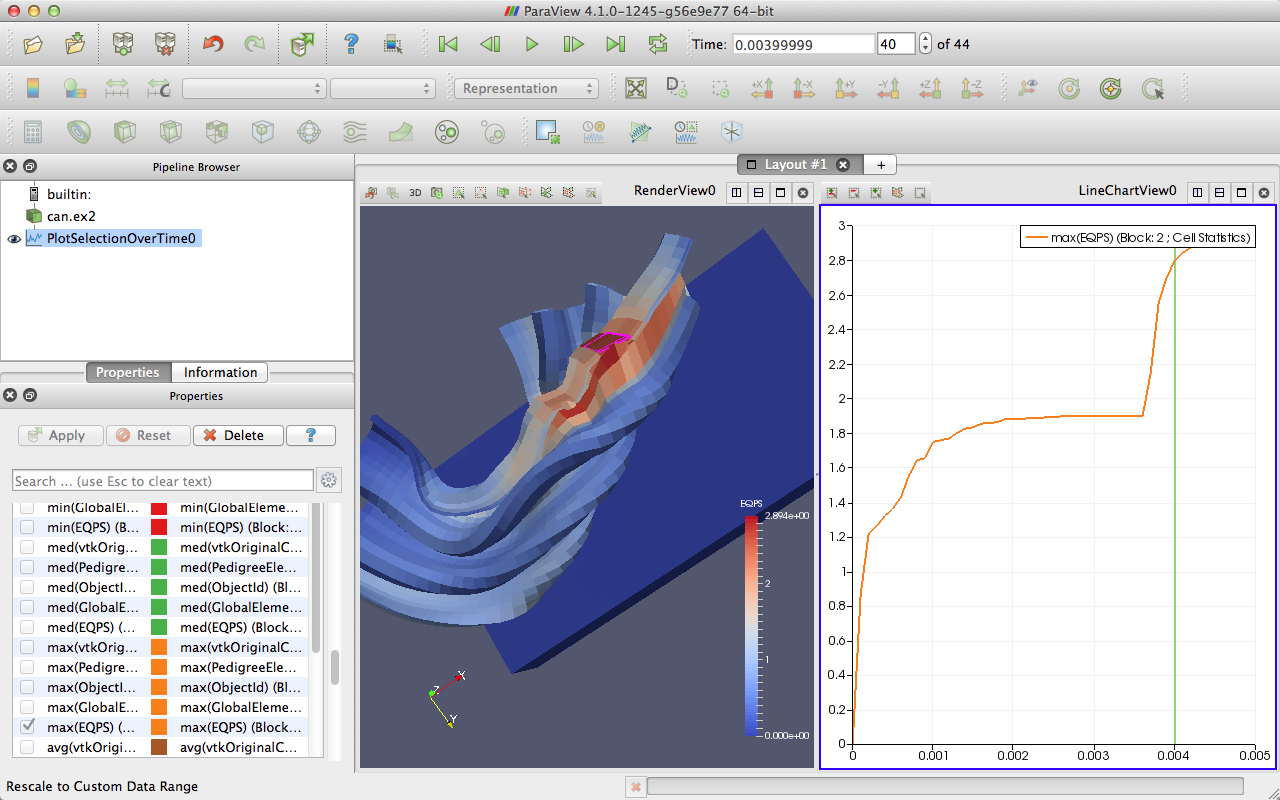
Note that the selection you had was automatically added as the selection
to use in the Properties panel when the Plot Selection Over Time
filter was created. If you want to change the selection, simply make a new one
and click Copy Active Selection in the Properties panel.
Also note that the plot was for the maximum EQPS value at each timestep, which could potentially be from a different cell at every timestep. If the desire is to identify a cell with a maximum value at some timestep and then plot that cell’s value at every timestep, then use the Freeze Selection feature demonstrated in Exercise 2.28.
You can also extract a selection in order to view the selected points or
cells separately or perform some independent processing on them. This is
done through the Extract Selection filter.
Exercise 2.31 (Extracting a Selection)
We are going to start a fresh visualization,
so if you have been following along with the exercises so far, now is
a good time to reset ParaView. The easiest way to do this is to select
from the toolbar.
Open the file can.ex2, load all variables,
(see
Exercise 2.19).Make a sizable cell selection for example, with Select Cells Through
.Create an Extract Selection
filter (available on the
toolbar and from the find data panel).- .
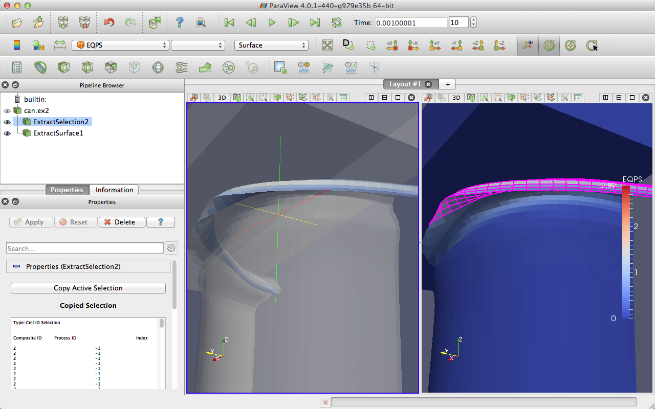
The object in the view is replaced with the cells that you just selected. (Note that in this image I added a translucent surface and a second view with the original selection to show the extracted cells in relation to the full data.) You can perform computations on the extracted cells by simply adding filters to the extract selection pipeline object.
As we described before, Views and Find Data panel can be used to create
different types of selections. To save and combine the created selections, you can use
the Selection Editor panel. This panel can be accessed from View → Selection Editor.
Exercise 2.32 (Selection Editor)
We are going to start a fresh visualization,
so if you have been following along with the exercises so far, now is
a good time to reset ParaView. The easiest way to do this is to select
from the toolbar.
Open the file can.ex2, load all variables,
(see
Exercise 2.19) and click .Enable View → Selection Editor.
Use
to create a frustum cell selection at the bottom-left part of the can,
and press  in the Selection Editor to save the created selection. As you can see the
saved selection has a name s0, and it’s described as a frustum selection.
in the Selection Editor to save the created selection. As you can see the
saved selection has a name s0, and it’s described as a frustum selection.Use
to select the top block of the can and press in the Selection Editor
to save the created selection.On top of the frustum selection that you created previously, use
to create a
slightly smaller polygon cell selection, and press in the Selection Editor to save the
created selection.You can click on the previous Frustum selection in the Selection Editor to interactively visualize it.
Open the Find data panel
, select can.ex2 as the Data Producer, select Cell as the Element
Type. Set ID \(>=\) 3600 and press “Find Data” button. Finally,
press in the Selection Editor to save the created selection.The Selection Editor should now have 4 different selections, which can be combined using a boolean expression. Set Expression to \(s1|(s0\) ^ \(s2)|s3\).
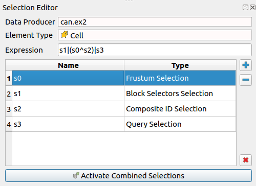
Press Activate Combined Selections.
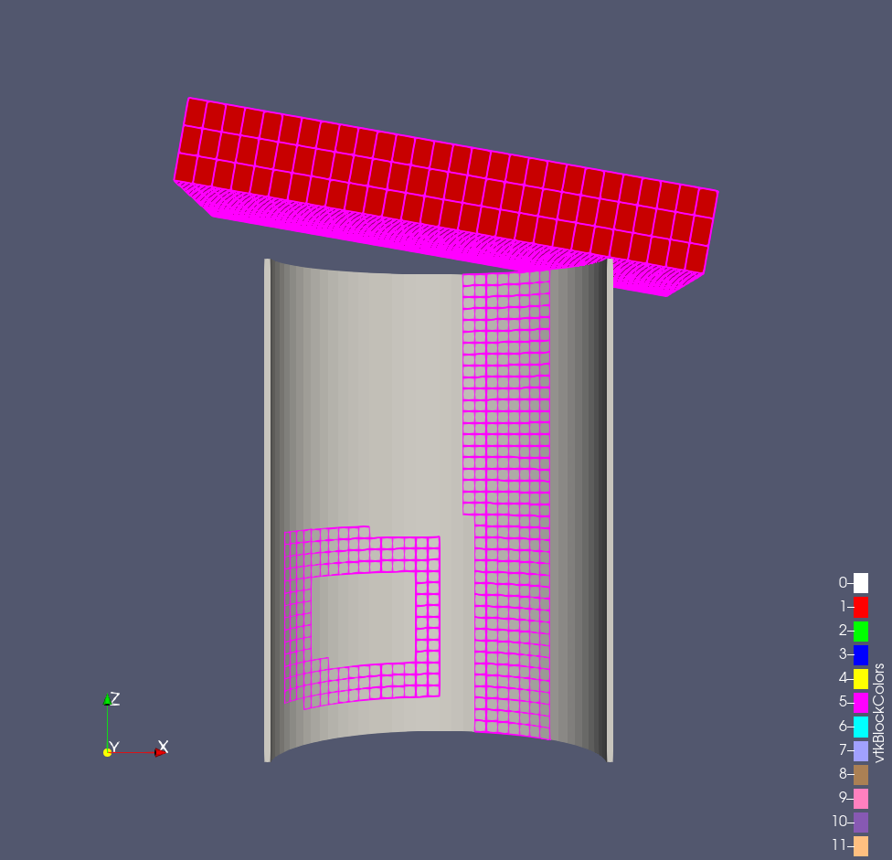
More information regarding the Selection Editor can be found in Section 7.8 of the User’s Guide.
2.15. Animations
Notice
This part mention the animation view. This was replaced by the time manager. While the interfaces are quite similar, some differences may exist. Please see the ParaView User’s Guide ‘Animation’ section for more.
We have already seen how to animate a dataset with time in it (hit )
and other ways to manipulate temporal data in Section 2.11. However,
ParaView’s animation capabilities go far beyond that. With ParaView you
can animate nearly any property of any pipeline object.
Exercise 2.33 (Animating Properties)
We are going to start a fresh visualization, so if you have been following
along with the exercises so far, now is a good time to reset ParaView.
The easiest way to do this is to select from the toolbar.
Use the quick launch (ctrl+space Win/Linux, alt+space Mac) to create the Sphere source and
it.If the animation view is not visible, make it so: View → Animation View.
Change the No. Frames option to 50 (10 will go far too quickly).
Find the property selection widgets at the bottom of the animation view and select Sphere1 in the first box and Start Theta in the second box.
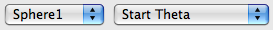
Hit the button.

If you play the animation, you will see the sphere open up
then eventually wrap around itself and disappear.
|
|
|
|
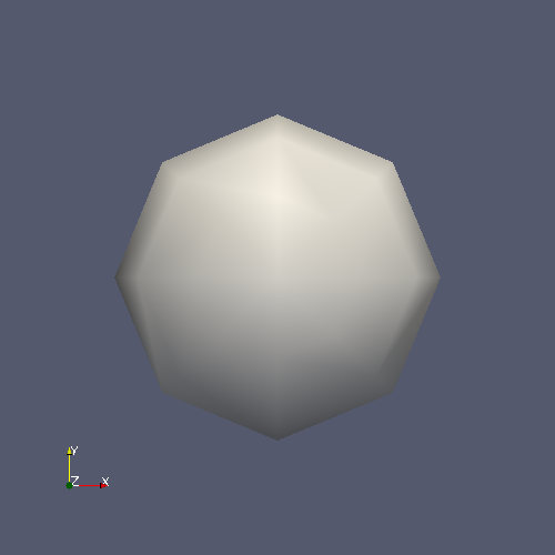
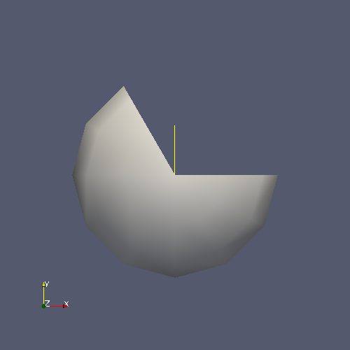
What you have done is created a track for the Start Theta property of the Sphere1 object. A track is represented as horizontal bars in the animation view. They hold key frames that specify values for the property at a specific time instance. The value for the property is interpolated between the key frames. When you created a track two key frames were created automatically: a key frame at the start time with the minimal value and a key frame at the end time with the maximal value. The property you set here defines the start range of the sphere.
You can modify a track by double clicking on it. That will bring up a dialog box that you can use to add, delete, and modify key frames.
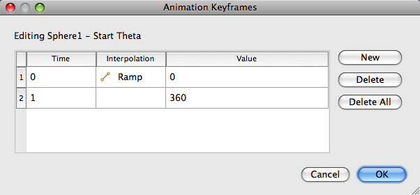
We use this feature to create a new key frame in the animation in the next exercise.
Exercise 2.34 (Modifying Animation Track Keyframes)
This exercise is a continuation of Exercise 2.33. You will need to finish that exercise before beginning this one.
Double-click on the Sphere1 – Start Theta track.
In the Animation Keyframes dialog, click the New button. This will create a new key frame.
Modify the first key frame value to be 360.
Modify the second key frame time to be 0.5 and value to be 0.
Click OK.
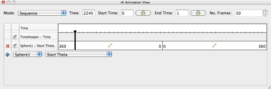
When you play the animation, the sphere will first get bigger and then get smaller again.
You are not limited to animating just one property. You can animate any number of properties you wish. Now we will create an animation that depends on modifying two properties.
Exercise 2.35 (Multiple Animation Tracks)
This exercise is a continuation of Exercise 2.33 and Exercise 2.34. You will need to finish those exercises before beginning this one.
Double-click on the Sphere1 – Start Theta track.
In the Animation Keyframes dialog, Delete the first track (at time step 0).
Click OK.
In the animation view, create a track for the Sphere1 object, End Theta property.
Double-click on the Sphere1 – End Theta track.
Change the time for the second key frame to be 0.5.
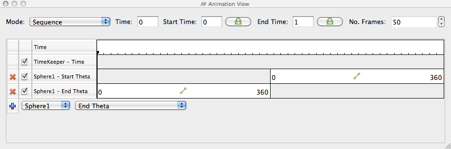
The animation will show the sphere creating and destroying itself, but
this time the range front rotates in the same direction. It makes for a
very satisfying animation when you loop  the animation.
In addition to animating properties for pipeline objects, you can animate the camera. ParaView provides methods for animating the camera along curves that you specify. The most common animation is to rotate the camera around an object, always facing the object, and ParaView provides a means to automatically generate such an animation.
Exercise 2.36 (Camera Orbit Animations)
For this exercise, we will orbit the camera around whatever data you have loaded. If you are continuing from the previous exercise, you are set up. If not, simply load or create some data. To see the effects, it is best to have asymmetry in the geometry you load. can.ex2 is a good dataset to load for this exercise.
Place the camera where you want the orbit to start. The camera will move to the right around the viewpoint.
Make sure the animation view panel is visible (View → Animation View if it is not).
In the property selection widgets, select Camera in the first box and Orbit in the second box.

Hit the button.
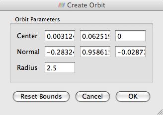
Before the new track is created, you will be presented with a dialog box that specifies the parameters of the orbit. The default values come from the current camera position, which is usually what you want.
Click OK.
Play
.
The camera will now animate around the object.
Another common camera annotation is to follow an object as it moves through space. Imagine a simulation of a traveling bullet or vehicle. If we hold the camera steady, then the object will quickly move out of view. To help with this situation, ParaView provides a special track that allows the camera to follow the data in the scene.
Exercise 2.37 (Following Data in an Animation)
We are going to start a fresh visualization, so if you have been following
along with the exercises so far, now is a good time to reset ParaView.
The easiest way to do this is to select from the toolbar.
Open the file can.ex2, load all variables,
(see Exercise 2.19).Press the
button to orient the camera to the mesh.Make sure the animation view panel is visible (View → Animation View if it is not).
In the property selection widgets, select Camera in the first box and Follow Data in the second box.
Hit the button.
Play
.
Note that instead of the can crushing to the bottom of the view, the animation shows the can lifted up to be continually centered in the image. This is because the camera is following the can down as it is crushed.