13. Axes Grid
Oftentimes, you want to render a reference grid in the background for a
visualization – think axes in a chart view, except this time we are talking of the 3D
Render View . Such a grid is useful to get an understanding for the data bounds and
placement in 3D space. In such cases, you use the Axes Grid . Axes Grid renders a 3D
grid with labels around the rendered scene. In this chapter, we will take a
closer look at using and customizing the Axes Grid and present different types of axes.
13.1. The basics
To turn on the Axes Grid for a Render View , you use the
Properties panel. Under the View section, you check the
Axes Grid checkbox to turn the Axes Grid on for the active view.
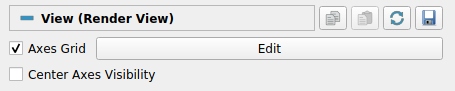
Clicking on the Edit button will pop up the Axes Grid
properties dialog ( Fig. 13.1)
that allows you to customize the Axes Grid . As with the Properties
panel, this is a searchable dialog, hence you can use the Search box at the
top of the dialog to search of properties of interest. At the same time, the
 button can be used to toggle between default and
advanced modes for the panel.
button can be used to toggle between default and
advanced modes for the panel.
Using this dialog, you can change common properties like the titles
( X Title , Y Title , and Z Title ),
title and label fonts using Title Font Properties
and Label Font Properties for each of the axes directions,
as well as the Grid Color . Besides labeling the axes, you can render a
grid by checking Show Grid . Once you have the Axes Grid setup to your
liking, you can use the  to save your
selections so that they are automatically loaded next time you launch ParaView.
You can always use the
to save your
selections so that they are automatically loaded next time you launch ParaView.
You can always use the  to revert back to ParaView
defaults.
to revert back to ParaView
defaults.
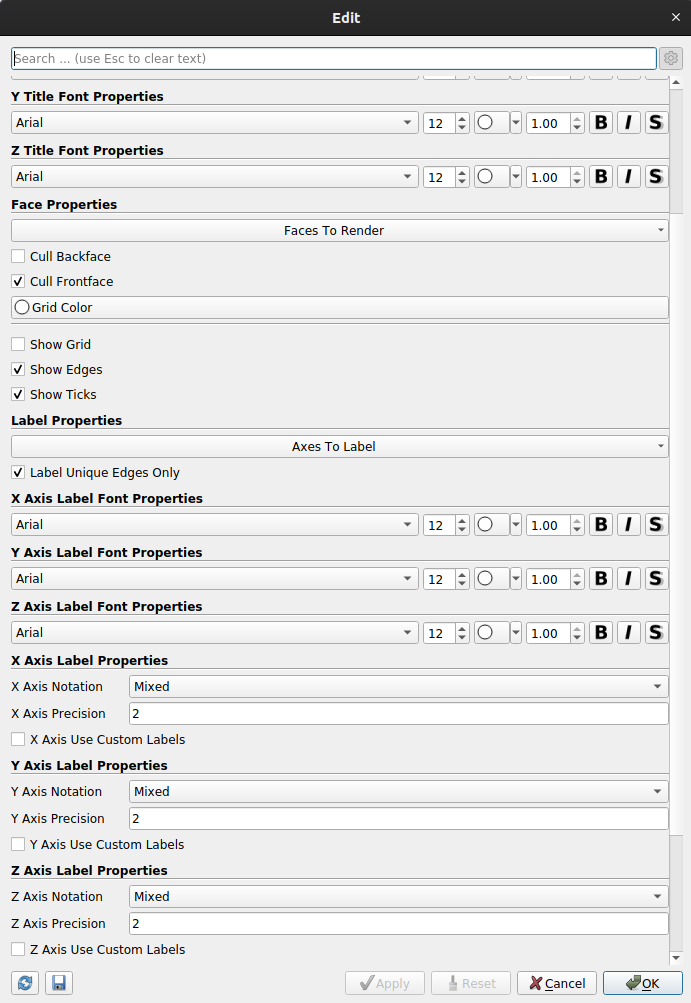
Fig. 13.1 Edit Axes Grid dialog is used to customize the Axes Grid .
13.2. Use cases
To get a better look at the available customizations, let’s look at various
visualizations possible and then see how you can set those up using the
properties on the Edit Axes Grid dialog. In these examples, we use the
disk_out_ref.ex2 example dataset packaged with ParaView.
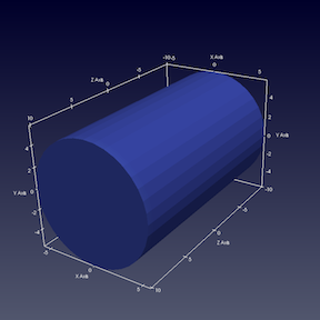
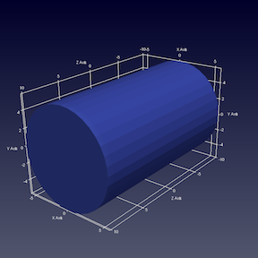
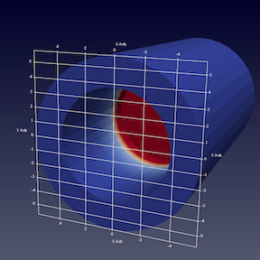
In the images above, on the left is the default Axes Grid .
Simply turning on the visibility of the Axes Grid
will generate such a visualization. The axes places always stay behind the
rendered geometry even as you interact with the scene. As you zoom in and out,
the labels and ticks will be updated based on visual cues.
To show a grid along the axes planes, aligned with the ticks and labels, turn
on the Show Grid checkbox, resulting in a visualization on the right.
By default, the gridded faces are always the farthest faces i.e. they stay behind
the rendered geometry and keep on updating as you rotate the scene. To fix which
faces of the bounding-box are to be rendered, use the Faces To Render
button (it’s an advanced property, so you may have to search for it using the
Search box in the Edit Axes Grid dialog). Suppose, we want to label
just one face, the lower XY face. In that case, uncheck all the other faces
except Min-XY in menu popped up on clicking on the Faces to Render
button. This will indeed just show the min-XY face, however as you rotate the
scene, the face will get hidden as soon as the face gets closer to the camera
than the dataset. This is because, by default, Cull Frontfaces is enabled.
Uncheck Cull Frontfaces and ParaView will stop removing the face as it
comes ahead of the geometry, enabling a visualization as follows.
Besides controlling which faces to render, you can also control where the labels
are placed. Let’s say we want ParaView to decide how to place labels along the Y
axis, however for the X axis, we want to explicitly label the values \(2.5\),
\(0.5\), \(-0.5\), and \(-4.5\). To that, assuming we are the advanced mode for the
Edit Axes Grid panel,
check X Axis Use Custom Labels .
That will show a table widget that allows you to add values as shown below.
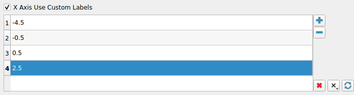
Using the  button, add the custom values.
While at it, let’s also change the
button, add the custom values.
While at it, let’s also change the X Axis Label Font Properties
and X Axis Title Font Properties to change the color
to red and similar for the Y axis, let’s change the color to green. Increase the
title font sizes to 18, to make them stand out and you will get a visualization
as follows (below, left).
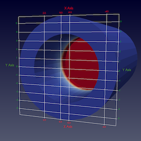
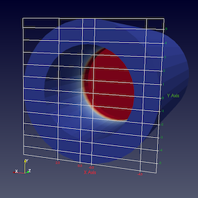
Here we see that both sides of the axis plane are
labeled. Suppose you only want to label one of the sides, in that case use the
Axes To Label property to uncheck all but
Min-X and Min-Y . This
will result in the visualization shown above, right.
13.3. Axes Grid in pvpython
In pvpython, Axes Grid is accessible as the AxesGrid property on the
render view.
>>> renderView = GetActiveView()

# AxesGrid property provides access to the AxesGrid object.
>>> axesGrid = renderView.AxesGrid

# To toggle visibility of the axes grid,
>>> axesGrid.Visibility = 1
All properties on the Axes Grid that you set using the Edit Axes Grid
dialog are available on this axesGrid object and can be changed as follows:
>>> axesGrid.XTitle = 'X Title'
>>> axesGrid.XTitleColor = [0.6, 0.6, 0.0]
>>> axesGrid.XAxisLabels = [-0.5, 0.5, 2.5, 3.5]
Note you can indeed use the tracing capabilities described in
Section 1.6.2 to determine what Python API to use to change a
specific property on the Edit Axes Grid dialog or use help .
>>> help(axesGrid)
Help on GridAxes3DActor in module paraview.servermanager object:

class GridAxes3DActor(Proxy)
 |  GridAxes3DActor can be used to render a grid in a render view.
 |
 |  Method resolution order:
 |      GridAxes3DActor
 |      Proxy
 |      __builtin__.object
 |
 |  Methods defined here:
 |
 |  Initialize = aInitialize(self, connection=None, update=True)
 |
 |  ----------------------------------------------------------------------
 |  Data descriptors defined here:
 |
 |  AxesToLabel
 |      Set the mask to select the axes to label. The axes labeled will be a subset of the
 |      axes selected depending on which faces are also being rendered.
 |
 |  CullBackface
 |      Set to true to hide faces of the grid facing away from the camera i.e. hide all
 |      back faces.
 |
 |  CullFrontface
 |      Set to true to hide faces of the grid facing towards from the camera i.e. hide all
 |      front faces.
 |
 |  DataPosition
 |      If data is being translated, you can show the original data bounds for the axes
 |      instead of the translated bounds by setting the DataPosition to match the
 |      translation applied to the dataset.
 |
 ...
13.4. Data Axes Grid
In order to get a grid adapted to a specific dataset, you can instead use
the Data Axes Grid, under the Display section.
Then the origin and bounds of the grid will be computed from the active pipeline
source, and not from the whole scene.

Fig. 13.2 Data Axes Grid (left) is centered on active data. View Axes Grid (right) handles the whole scene.
Its configuration is very similar to the Axes Grid, as detailed in Section 13.1.
13.5. The Polar Axes
If you want to use polar coordinates, you can use the Polar Axes, under Display section.
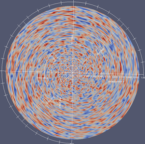
Fig. 13.3 Example of Polar Axes coordinates system.
Many parameters can be configured from the Edit button.
The Polar Axes can be seen as a combination of different objects.
It starts from a main axis, called Polar Axis, where the radial distance can be measured.
Different Radial Axes sharing a same origin are oriented with a specific angle.
They are optionally linked with some Arcs.

Fig. 13.4 The Polar Axes different components.
13.6. Legend Grid and Polar Grid
Sometimes you may prefer to have your grid in the screen space, i.e., always on top
of the scene. To configure this you should turn on the Camera Parallel Projection
under the View section. Then you can select the Legend Grid or the Polar Grid,
its polar coordinates counterpart.

Fig. 13.5 The Polar Grid (left) and the Legend Grid (right) are always on top of the View.